For Canadian online stores, the gap between a good month and a great one rarely comes down to traffic. It comes down to what happens after the click. A shopper in Toronto adds a winter jacket to their cart, reaches checkout, sees a shipping cost they did not expect, and leaves. Multiply that moment across thousands of sessions and you have the single biggest leak in most Canadian e-commerce businesses. The fix is rarely a bigger ad budget. It is design and UX decisions, made deliberately, around the three things Canadian buyers care about most: a checkout they trust, shipping that is honest and fast, and prices shown in their own currency.
This post breaks down the specific, actionable choices that reduce cart abandonment for stores selling in Canada. It is written for founders and marketing leads who already have a store and want it to convert better, and it pairs well with our complete guide to web design in Canada, which covers the wider strategy this checklist sits inside.
Why Canadian carts get abandoned
Cart abandonment is not one problem. It is a stack of small frictions that each cost you a few percent of buyers. In the Canadian market, the most common culprits are predictable, which is good news, because predictable problems have repeatable fixes.
- Surprise shipping costs. A customer in Vancouver does not mind paying for shipping. They mind finding out about it on the final screen.
- Currency ambiguity. Prices that could be USD or CAD create doubt, and doubt kills momentum at checkout.
- Unclear duties and taxes. If you ship from outside Canada, or sell cross-border, buyers want to know whether a customs bill is coming.
- Forced account creation. Asking someone to create an account before they can pay is one of the oldest and most expensive mistakes in e-commerce.
- Missing payment methods. Canadian shoppers expect Interac, major cards, and increasingly digital wallets and buy-now-pay-later options.
- Slow or clumsy mobile checkout. A large share of Canadian retail traffic is mobile, and a desktop-first checkout punishes most of your buyers.
Each of these is a design decision. Below, we work through them in the order a shopper experiences them.
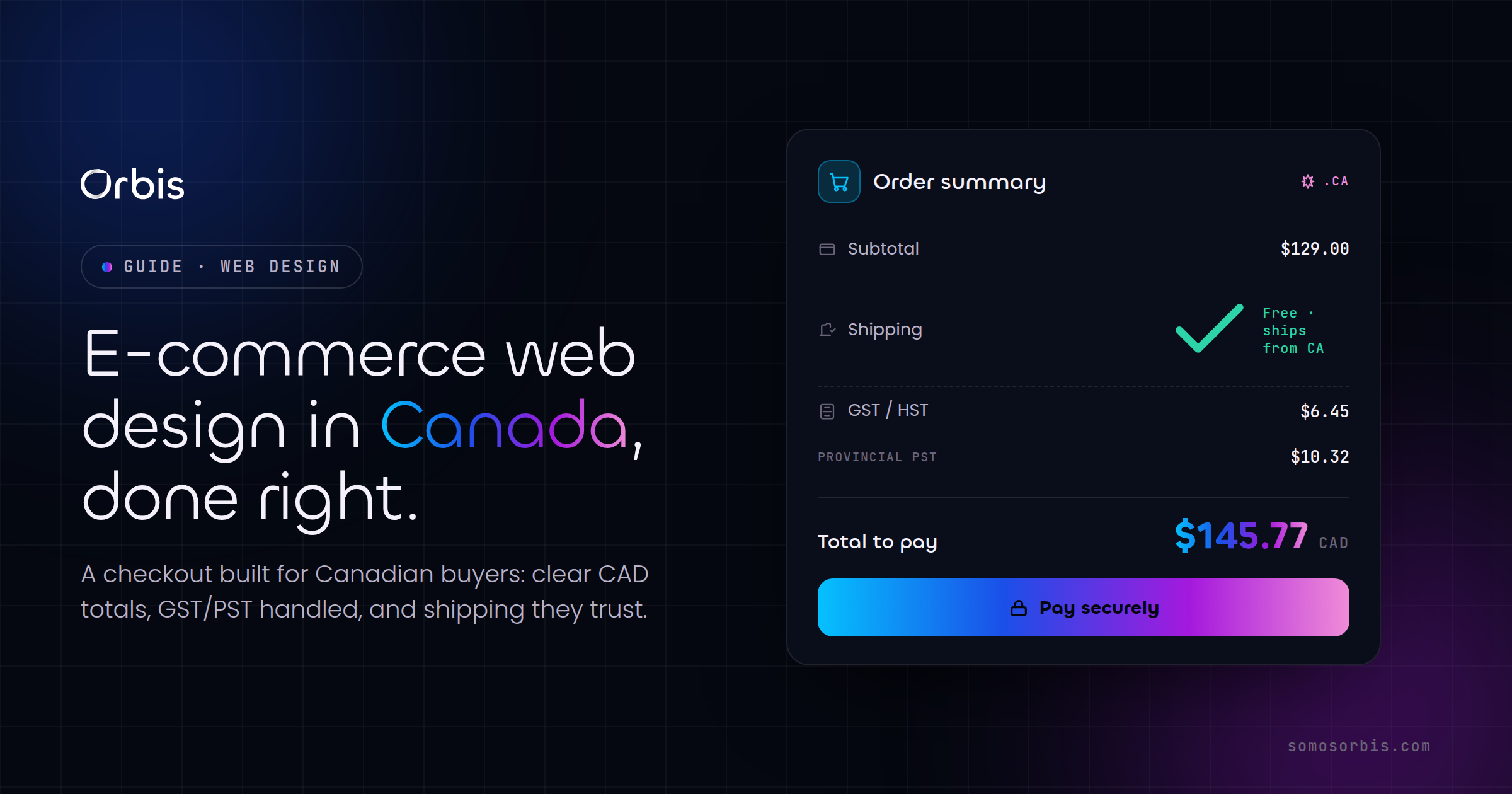
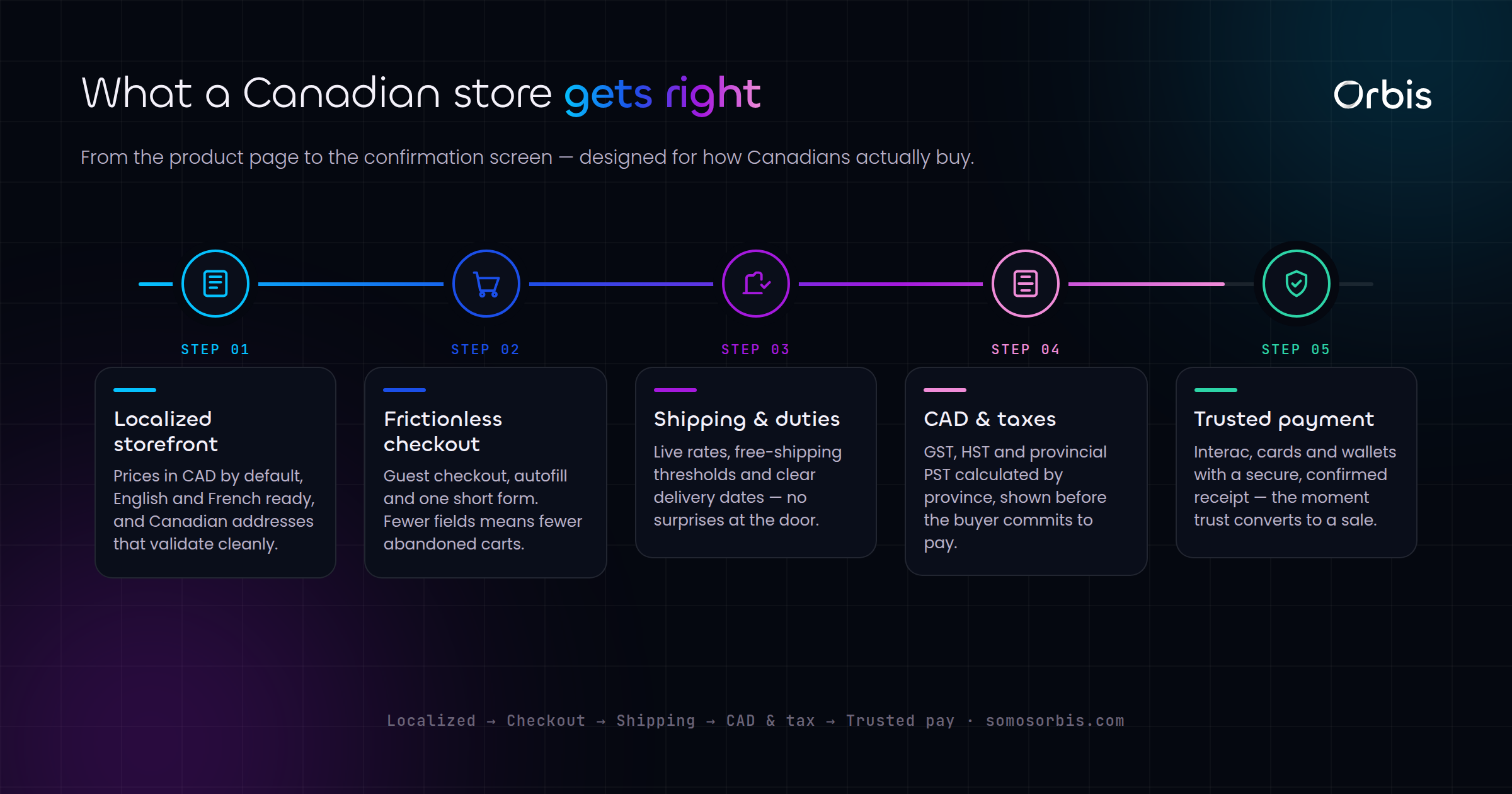
Show prices in CAD, clearly and everywhere
Currency is the first trust signal a Canadian buyer reads, often before they have consciously decided to buy. If your store serves Canada, prices should be shown in Canadian dollars with the currency made explicit. "CA$129" or "$129 CAD" removes ambiguity in a way that a bare "$129" never does, especially for shoppers who are used to seeing American stores priced in USD.
Practical rules for currency display
- Label the currency on product pages, in the cart, and at checkout, not just once in the footer.
- If you sell to both Canada and the US, detect location and default to CAD for Canadian visitors, while letting them switch manually.
- Never show a price in one currency and charge in another. The mismatch on a customer's card statement generates support tickets and chargebacks.
- If you run promotions around Canadian moments like Boxing Day or back-to-school, make sure the discounted price still reads clearly as CAD.
Currency clarity is a small change with outsized impact. It signals that you are a store built for Canadians, not an American site that happens to ship north of the border.
Make shipping honest and visible early
Shipping is the number one reason Canadian carts get abandoned, and almost always because the cost appeared too late. Canada is a large, logistically expensive country, and buyers know shipping is not free to provide. What frustrates them is the surprise, not the price.
Surface shipping costs before checkout
The goal is to remove every possible surprise before the final step. A few proven moves:
- Put a shipping estimator on the cart page. Let shoppers enter a postal code and see the real cost before they commit to checkout.
- State your free-shipping threshold prominently. If you offer free shipping over a certain CAD amount, show a progress bar ("You are $18 away from free shipping"). This both reduces abandonment and increases average order value.
- Be explicit about delivery zones. Shipping to a condo in downtown Toronto is very different from shipping to a rural address in the territories. Set expectations for remote and northern destinations clearly.
- Show realistic delivery windows. "3 to 5 business days" beats a vague "ships soon" every time, and it matters more during peak seasons when carriers are slow.
Handle duties and taxes up front
If you fulfill from inside Canada, say so, because it removes the fear of a customs bill. If you ship cross-border into Canada, tell the buyer whether duties and provincial taxes are included or collected on delivery. Provincial sales tax varies, so display tax as a clear line item at checkout rather than folding it silently into the total. Transparency here is not just good UX, it keeps you aligned with current regulations and avoids disputes after the sale.
Design a checkout built for conversion
The checkout is where intent turns into revenue or evaporates. Every field, every step, and every second of load time is a chance for the buyer to reconsider. The principle is simple: ask for the minimum, in the clearest possible order, with no surprises.
Guest checkout is non-negotiable
Always offer guest checkout. Forcing account creation before payment is one of the most reliable ways to lose a sale. You can invite the customer to create an account after the purchase, when you already have their details and they have a reason to come back. At that point a one-click "save my info for next time" feels like a convenience, not a barrier.
Reduce fields and steps
- Use a single-column layout. Multi-column forms cause people to miss fields and make errors.
- Auto-detect city and province from the postal code where possible. Canadian postal codes are precise, so this is achievable and feels effortless.
- Combine billing and shipping with a "same as shipping" checkbox, ticked by default.
- Show a progress indicator so buyers know how many steps remain.
- Validate inline. Tell someone their postal code is malformed as they type, not after they hit "Pay".
Offer the payment methods Canadians actually use
Payment choice is a conversion lever. A Canadian checkout should support, at minimum, major credit and debit cards, Interac, and the digital wallets your customers already have set up, such as Apple Pay and Google Pay, which fill in shipping and payment details in a single tap. Many Canadian retailers also see lift from buy-now-pay-later options around higher-ticket purchases and seasonal peaks. The more friction you remove from the payment step itself, the fewer carts you lose at the very last moment.
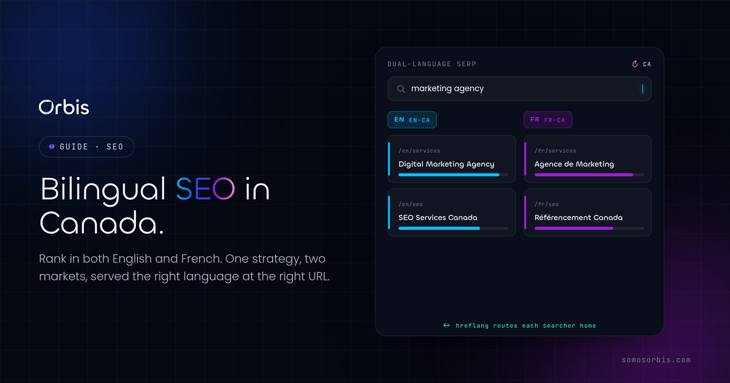
Bilingual checkout for the whole country
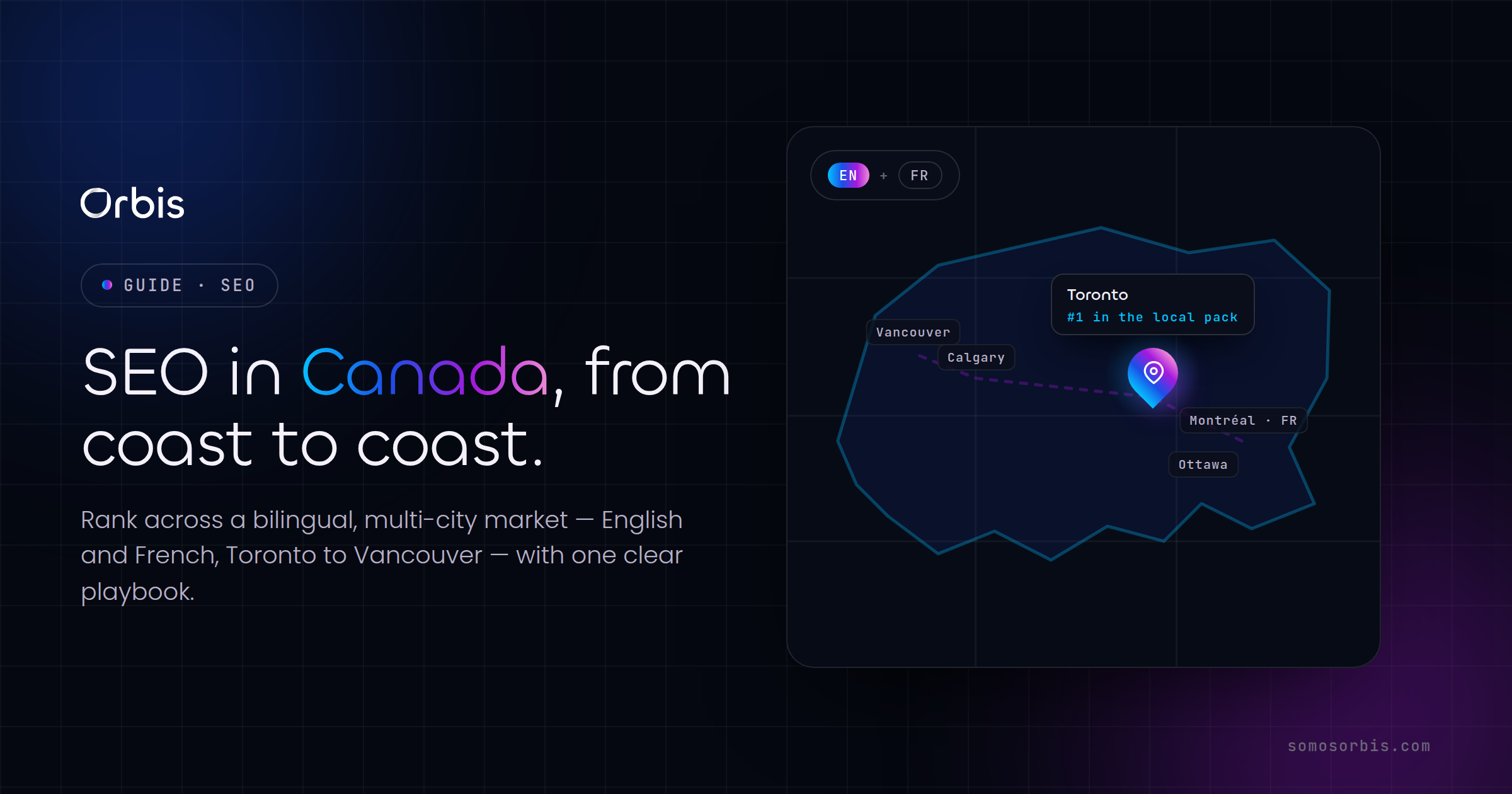
Canada is bilingual, and a meaningful share of your buyers shop in French. A checkout that switches cleanly between English and French, including error messages, shipping labels, and confirmation emails, signals that you take the entire Canadian market seriously. This is especially important if you have customers in Montreal and across Quebec, where a French-first experience is often expected rather than appreciated. If you are weighing how deep to take bilingual support, our breakdown of custom web development in Canada covers when off-the-shelf localization is enough and when you need engineered support.
Optimize for mobile first
Most Canadian shoppers browse, and increasingly buy, on their phones. A checkout that feels fine on a laptop but cramped on a phone is leaking money from your largest segment of traffic. Mobile-first is not a nice-to-have, it is the default your store should be designed around.
- Use large, thumb-friendly tap targets. Small buttons and tightly packed links cause mis-taps and frustration.
- Trigger the right keyboard. Show a numeric keypad for card numbers and postal codes, an email keyboard for the email field.
- Keep the call to action visible. A sticky "Pay" button that stays in view as the buyer scrolls reduces hesitation.
- Compress images and defer non-essential scripts. A slow mobile checkout on a transit connection is an abandoned checkout.
Speed deserves special attention. Every additional second of load time measurably reduces conversion. Lazy-load below-the-fold imagery, serve appropriately sized images, and keep third-party scripts to the ones that earn their place.
Build trust at the point of payment
Even a buyer who wants the product needs a final nudge of reassurance before entering card details. Trust signals at checkout are not decoration, they are conversion infrastructure.
- Display recognizable payment and security badges near the pay button.
- Show a clear, findable return and refund policy. Canadian shoppers check this before buying, particularly for apparel and higher-ticket items.
- Provide a real support contact, ideally with response-time expectations.
- Include concise social proof, such as a review count or rating, close to the buying decision.
- Confirm the order immediately with a clear summary and a realistic delivery window.
Trust compounds. A store that is transparent about shipping, honest about currency, and clear about returns earns repeat buyers, and repeat buyers are far cheaper to convert than new traffic.
Platform choice shapes what is possible
The platform underneath your store sets the ceiling on how good the checkout can be. Many Canadian businesses build on Shopify because it handles CAD pricing, Canadian payment methods, tax logic, and mobile-optimized checkout with far less custom work. If you are leaning that way, our guide to Shopify store design for Canadian merchants walks through the design and configuration choices that matter most for the Canadian market.
That said, off-the-shelf is not always the right answer. Stores with complex catalogues, B2B pricing tiers, subscription logic, or unusual fulfilment needs often outgrow a templated checkout and benefit from a more engineered approach. The decision is not "custom versus platform", it is matching the build to the revenue model, then designing the checkout experience with the same care regardless of what runs underneath.
A practical pre-launch checklist
Before you push changes live, run through this list. It captures the decisions that move the needle for Canadian stores.
- Prices show CAD explicitly on every page where money appears.
- Shipping cost is visible on the cart page via a postal-code estimator.
- Free-shipping threshold, if any, is shown with a progress indicator.
- Duties and provincial taxes are stated clearly, never hidden in the total.
- Guest checkout is available and obvious.
- The form is single-column, with city and province auto-filled from postal code.
- Cards, Interac, and digital wallets all work and are tested.
- The full checkout works in both English and French.
- Mobile checkout is fast, with a sticky pay button and correct keyboards.
- Trust signals, returns policy, and a real support contact are present at the pay step.
Turn checkout into your advantage
The Canadian stores that win are not the ones with the flashiest homepages. They are the ones that remove every reason to hesitate at the moment of purchase: clear CAD pricing, honest shipping shown early, a fast bilingual checkout, and trust signals exactly where doubt creeps in. These are design and UX decisions, and they are entirely within your control.
If you want a checkout engineered to convert Canadian buyers, our team designs and builds online stores around exactly these principles. Explore our e-commerce website design services in Canada to see how we turn browsers into buyers, with documented processes, revenue-focused engineering, and compliance built in from the first wireframe.