For a Canadian company, the corporate website is rarely the place where a deal closes. It is the place where a deal is qualified, validated, or quietly abandoned. A procurement lead in Toronto, a partner in Montreal, or a prospective hire in Vancouver lands on your homepage and, within seconds, forms a judgment about whether your organization is credible, established, and safe to work with. Corporate website design in Canada is the discipline of engineering that judgment in your favour — through clarity, accessibility, bilingual reach, and visible proof that you operate to current standards.
This guide walks through how Canadian companies build corporate sites that earn trust. It is written for the people responsible for the outcome: marketing leads, founders, and operations managers who need a site that performs commercially, not just one that looks modern. If you want the full strategic picture first, start with our complete guide to web design in Canada, which frames the broader decisions this article builds on.
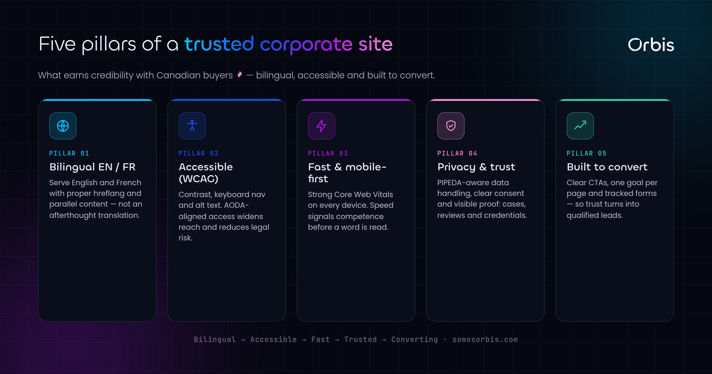
Why Corporate Websites Carry More Trust Pressure in Canada
A corporate website is not a campaign landing page. It represents the entire organization — its governance, its longevity, its relationships, and its accountability. In the Canadian market, that trust pressure is amplified by a few realities that companies in single-language, single-jurisdiction markets simply do not face.
- Bilingual expectation. English and French are both official languages. For companies operating nationally — or selling into Quebec, federal, or regulated sectors — a French-language experience is not a nicety, it is a baseline credibility signal.
- Accessibility as a norm. Canadian organizations increasingly treat accessible design as a standard expectation, not an afterthought. Provinces such as Ontario have well-established accessibility frameworks, and federal entities operate to their own requirements. A site that excludes users with disabilities reads as careless.
- Conservative buying culture. Canadian B2B buyers tend to be deliberate and risk-averse. They look for evidence of stability — years in operation, real client volume, recognizable partners — before they engage.
- Regional and seasonal nuance. A national audience spans different time zones, climates, and rhythms. A corporate site that acknowledges Canadian context (pricing in CAD, Canadian phone formats, awareness of seasonal cycles like back-to-school or the holiday quarter) feels native rather than imported.
Getting these right is the core work of professional corporate web design. The rest of this article breaks down how.
The Trust Architecture of a Canadian Corporate Site
Trust on a corporate website is built deliberately, element by element. Think of it as an architecture rather than a coat of paint. Each layer answers a silent question the visitor is asking.
1. Immediate clarity: "What does this company actually do?"
The single most common failure on corporate homepages is vague positioning. A visitor should understand, above the fold, what you do, who you do it for, and why it matters. Avoid abstract slogans that could belong to any company in any industry. State the value plainly, then let the supporting content prove it.
2. Proof: "Can I trust them?"
Credibility signals do the heavy lifting here. Use only claims you can genuinely stand behind:
- Years in operation and client volume, stated as concrete numbers.
- Recognizable partner and platform badges that a Canadian buyer will know.
- Genuine review scores and ratings, displayed honestly.
- Logos of sectors or client types you serve (where permitted).
- Clear contact information, a real Canadian address or service footprint, and named people where appropriate.
The principle is simple: never manufacture proof. A fabricated metric is worse than no metric, because Canadian buyers verify. Honest, specific evidence outperforms inflated, vague claims every time.
3. Structure: "Can I find what I need?"
Corporate sites tend to accumulate pages — services, sectors, about, careers, resources, contact. Without disciplined information architecture, that growth becomes a maze. Map your navigation around how visitors actually think, not around your internal org chart. Group services logically, keep the main navigation shallow, and make the path to contact obvious from every page.
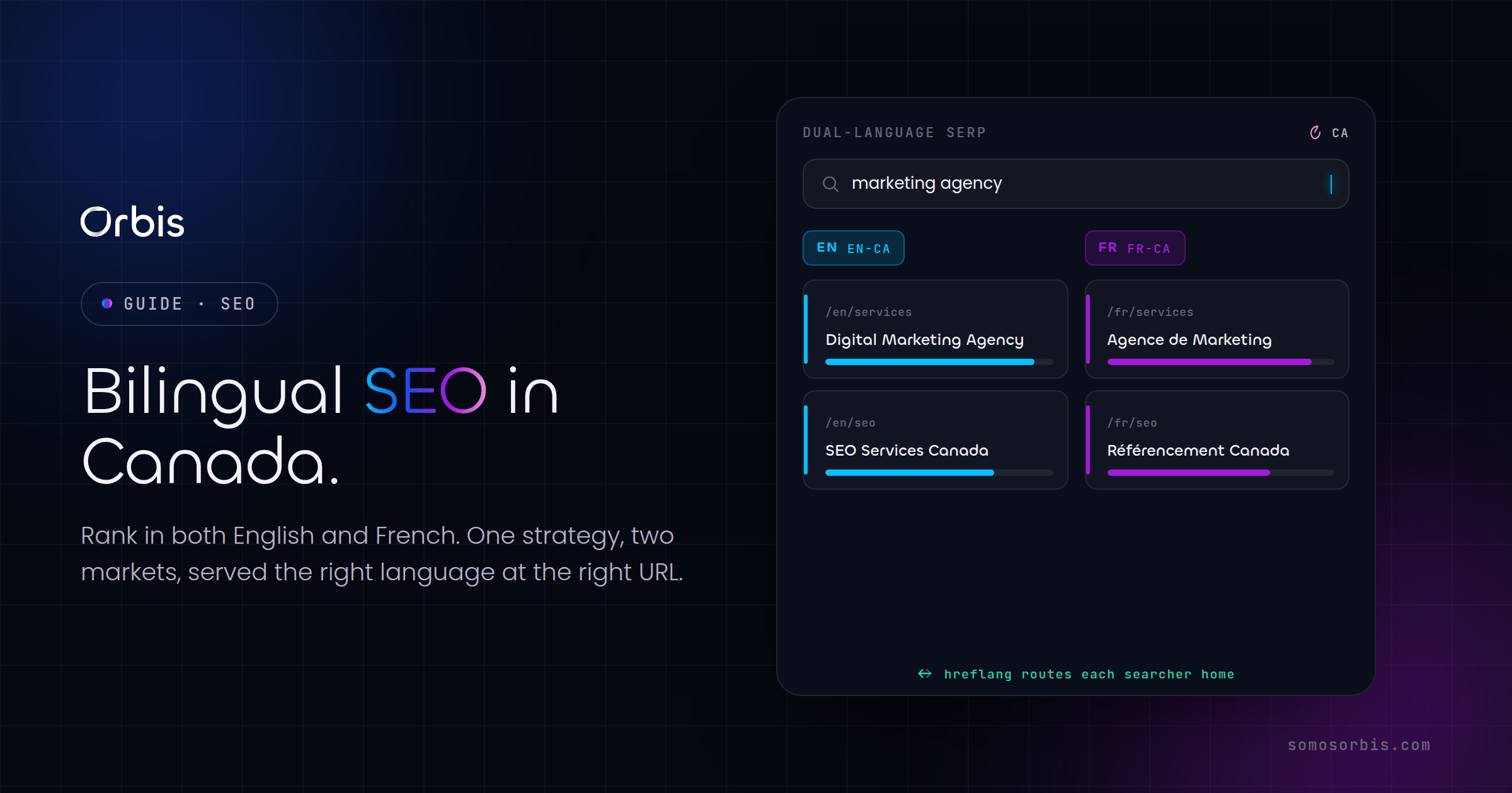
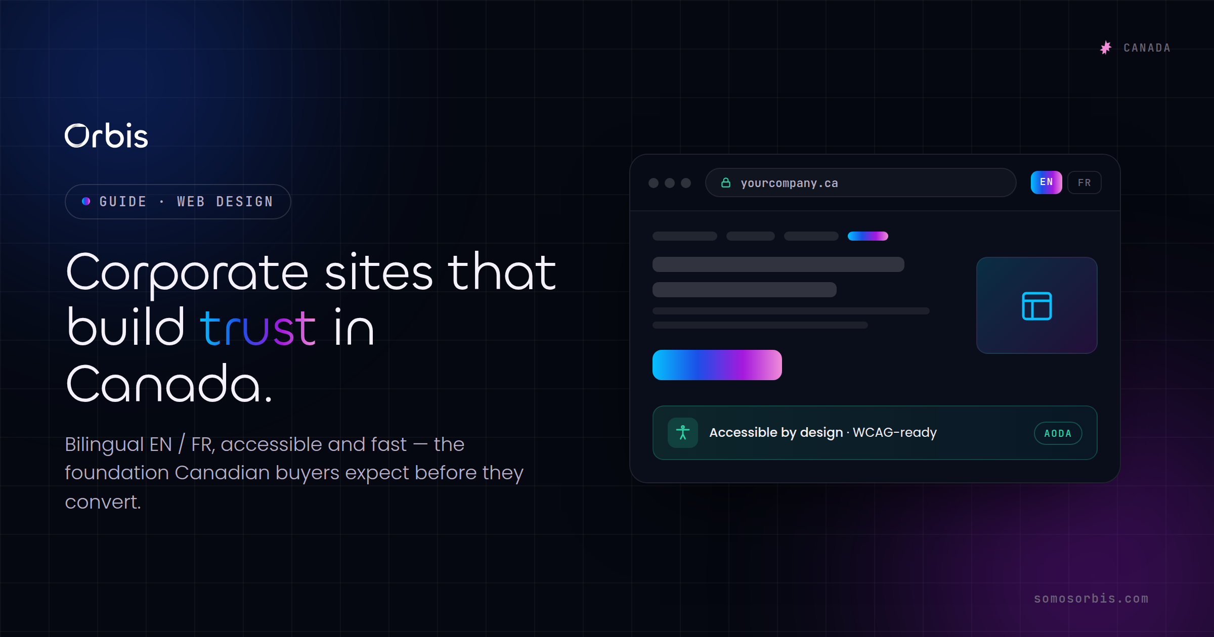
Bilingual Design: Building a Genuine EN/FR Experience
Many Canadian corporate sites treat French as an afterthought — a machine-translated mirror bolted on at the end. Buyers and regulators notice. A genuine bilingual experience requires intent from the start.
- Plan for two languages in the architecture. Build your URL structure, content model, and navigation to support parallel English and French versions cleanly. Retrofitting bilingualism into a monolingual build is expensive and error-prone.
- Translate for meaning, not words. Professional French copy — ideally Canadian French — reads naturally to a Quebec audience. Literal translation produces stiff, foreign-sounding text that undermines the trust you are trying to build.
- Localize the details. Dates, currency, phone formats, and culturally specific references should all adapt. A French page that still says "Boxing Day" in English or shows U.S. date formats breaks the illusion of a native experience.
- Make language switching obvious and persistent. A clear EN/FR toggle that keeps users on the same page in their chosen language is a small detail with a large impact on perceived professionalism.
- Treat SEO bilingually. Use proper language annotations so search engines serve the right version to the right audience. This protects your visibility in both English and French Canadian search results.
Done well, a bilingual site signals that you take the whole Canadian market seriously — which is exactly the impression a national corporate brand wants to leave.
Accessibility: Designing for Every Canadian User
Accessibility is where good intentions most often fall short. The good news is that the practices that make a site accessible also make it faster, clearer, and better for search. Accessibility and quality are the same project.
Practical, high-impact priorities for a Canadian corporate site include:
- Sufficient colour contrast between text and background, so content is readable for users with low vision and in bright conditions.
- Full keyboard navigation, so the entire site can be used without a mouse — essential for many assistive technologies.
- Descriptive alternative text on meaningful images, so screen-reader users receive the same information sighted users do.
- Logical heading structure (a single clear H1, nested H2s and H3s) that lets assistive technology and search engines understand the page.
- Labelled, forgiving forms with clear error messages and instructions that do not rely on colour alone.
- Resizable text and responsive layouts that hold up when users zoom or visit on smaller screens.
Beyond the ethical and commercial case, accessibility aligns with the expectations many Canadian organizations and public-sector partners now hold for the businesses they work with. Building to these quality processes from the outset is far cheaper than remediating later — and it widens your reachable audience at the same time.
Performance, Mobile, and Technical Credibility
A slow site quietly erodes trust. Canadian buyers browsing on mobile during a commute or between meetings will not wait for a heavy homepage to load. Performance is a credibility signal in its own right.
- Optimize for speed. Compress images, minimize unnecessary scripts, and prioritize what loads first. A fast first impression reinforces competence.
- Design mobile-first. A large share of corporate site traffic is mobile. Layouts, navigation, and calls to action all need to work on a phone before they work on a desktop.
- Secure by default. HTTPS, sensible data handling, and clear privacy information are non-negotiable. Compliance by design is part of looking trustworthy, especially when you handle business inquiries or personal data.
When your corporate site needs functionality beyond standard pages — portals, integrations, calculators, or bespoke workflows — the underlying build quality matters even more. Our guide to custom web development in Canada covers when a tailored build is worth the investment and how to scope it without overspending.
Turning Trust Into Action: Conversion on Corporate Sites
A corporate website that earns trust but never asks for action is a missed opportunity. The goal is not to be pushy; it is to make the next step obvious and easy for a visitor who is already convinced.
- One primary action per page. Whether it is "Request a consultation," "Book a call," or "Get a quote," each page should guide toward a single clear next step rather than scattering attention.
- Reduce friction in contact paths. Short, well-designed forms convert better than long ones. Ask only for what you genuinely need to start a conversation.
- Match the message to the moment. A visitor on your about page is at a different stage than one on a service page. Tailor the calls to action accordingly.
For high-intent campaigns and specific offers that sit alongside your corporate presence, dedicated pages convert better than general ones. Our breakdown of landing page design for conversions shows how to build focused pages that turn campaign traffic into qualified leads — a useful complement to the broader trust-building work of the corporate site itself.
A Practical Checklist for Canadian Corporate Website Design
Before you sign off on a corporate site build or redesign, run it against this checklist. If you cannot confidently tick each item, there is trust being left on the table.
- Above-the-fold clarity: a visitor understands what you do within seconds.
- Honest, specific proof: real numbers, recognizable partners, genuine reviews.
- Genuine bilingual experience: natural Canadian French, not machine translation.
- Accessibility built in: contrast, keyboard navigation, alt text, logical structure.
- Fast, mobile-first performance across devices and connections.
- Secure and privacy-aware by design.
- Clean information architecture with an obvious path to contact.
- One clear call to action per page, with low-friction forms.
- Canadian context throughout: CAD, local formats, regional and seasonal awareness.
A corporate website's job is to make a careful Canadian buyer feel that choosing you is the safe, obvious decision. Every design choice either reinforces that feeling or quietly works against it.
Build a Corporate Site That Earns the Business
Trust is not an accident of good taste — it is the product of deliberate decisions about clarity, accessibility, bilingual reach, performance, and proof. For Canadian companies, those decisions carry extra weight, because the market expects more and verifies what you claim. A corporate site that gets them right does more than look professional; it shortens sales cycles, qualifies better leads, and turns first impressions into real conversations.
If you are planning a new corporate website or rethinking one that no longer reflects how far your company has come, our team can help you build it on solid foundations. Explore our corporate web design services for Canadian companies to see how we approach trust, bilingual reach, accessibility, and conversion as one integrated system — and let's build a site that earns the business it deserves.