Driving traffic is the easy part. You can buy clicks on Google, Meta, or Pinterest tomorrow morning. The hard part is what happens after the click: whether a visitor in Toronto, Vancouver, or Montreal reads your page, trusts your offer, and takes action. That moment lives or dies on the landing page. A well-built landing page is not a prettier version of your homepage. It is a focused, single-purpose page engineered to turn paid and organic traffic into leads and sales. This playbook walks Canadian marketers through how to design and structure landing pages that actually convert, with examples grounded in the Canadian market.
At Orbis we have spent more than 15 years helping over 500 clients turn attention into revenue, and the same pattern shows up again and again: the brands that win are not the ones with the biggest ad budgets. They are the ones whose landing pages match the promise of the ad and remove every reason to hesitate. If you want the full strategic picture of how landing pages fit into a broader site, start with our complete guide to web design in Canada, then come back here for the conversion mechanics.
What a Landing Page Is (and Is Not)
A landing page is a standalone page with one job: to convert a specific visitor into a specific action. That action might be booking a demo, requesting a quote, downloading a guide, or completing a purchase. Everything on the page should serve that single goal.
Here is the distinction that trips up most Canadian businesses:
- A homepage serves everyone. It introduces your brand, links to dozens of sections, and lets people explore. It is built for discovery.
- A landing page serves one audience with one offer. It removes navigation, strips out distractions, and points every element toward a single conversion. It is built for decision.
When you send paid traffic to your homepage, you force the visitor to do the work of finding what your ad promised. Most won't. That is why a dedicated landing page, designed as a conversion tool, consistently outperforms sending the same traffic to a general page. If you are evaluating whether you need a dedicated build, our landing page design service is built specifically for this kind of focused, conversion-first page.
The Anatomy of a High-Converting Landing Page
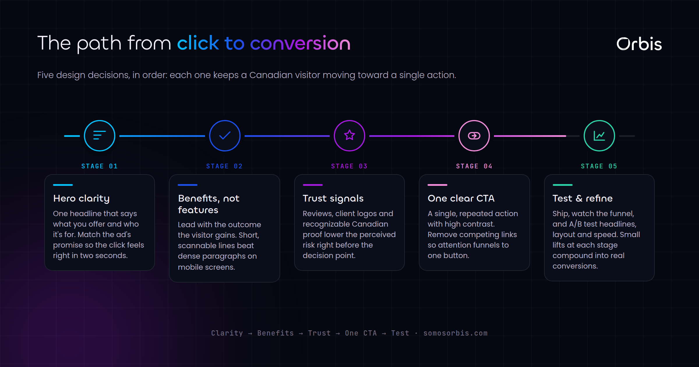
Strong landing pages share a predictable structure. The order matters because it mirrors how a visitor makes a decision: first they decide whether to stay, then whether to trust you, then whether to act.
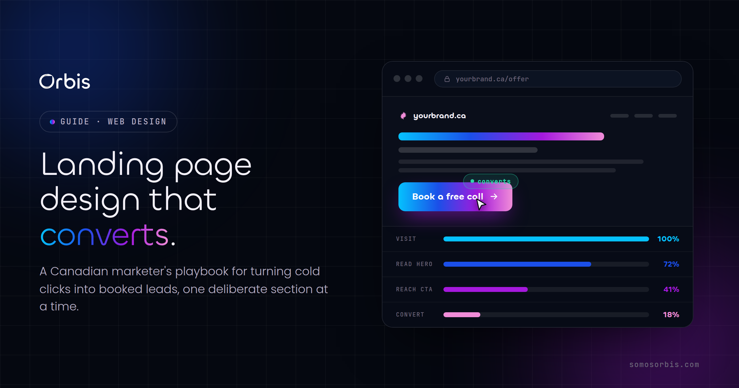
1. The Above-the-Fold Hero
The first screen a visitor sees has to answer three questions in under five seconds: What is this? Is it for me? What do I do next? That means a clear headline that states the outcome, a subheadline that adds context, and a single, visible call to action.
Avoid clever wordplay here. A Calgary HVAC company converts better with "Furnace Repair in Calgary, Same-Day Service" than with "We Keep You Cozy." The first one matches what someone typed into Google during a cold snap. The second makes them think.
2. Message Match With the Ad
This is the single most overlooked lever in Canadian paid media. If your Google Ad headline says "Bilingual Payroll Software for Canadian SMBs," the landing page headline should echo that language almost word for word. When the page confirms what the ad promised, the visitor relaxes. When it doesn't, they bounce and you have paid for a click that goes nowhere.
Practical tip: build separate landing pages for separate campaigns. A page targeting Montreal traffic should be available in French. A page for a Boxing Day promotion should mention Boxing Day. Relevance is conversion fuel.
3. The Value Proposition and Benefits
Once a visitor decides to stay, tell them why your offer is worth their time. Lead with outcomes, not features. Use short, scannable benefit statements supported by specifics:
- State the concrete result the customer gets, not the mechanism behind it.
- Use real numbers where you have them, and never invent metrics you cannot back up.
- Address the Canadian context directly: CAD pricing, local support hours, bilingual service, compliance with current regulations.
4. Social Proof
Canadians are cautious buyers. Reviews, ratings, recognizable client logos, and testimonials lower the perceived risk of acting. A star rating with a real review count, a partner badge, or a short quote from a named customer does more work than three paragraphs of self-description. Place social proof near every decision point, especially right above or beside your form and call-to-action button.
5. The Conversion Form or CTA
This is where the conversion actually happens, so it deserves disproportionate attention. Keep forms as short as the offer allows. If you only need a name and email to send a quote, ask for only a name and email. Every extra field is a reason to abandon.
6. Risk Reversal and the Close
Near the bottom, repeat your call to action and remove the last objection. A clear guarantee, a "no credit card required" note, a free consultation, or a transparent next-step explanation tells the visitor exactly what happens after they click. Uncertainty kills conversions; clarity revives them.
Design Principles That Move the Needle
Good landing page design is mostly about reducing friction and directing attention. A few principles deliver most of the results:
- One page, one goal. Remove the main navigation bar and competing links. If a visitor can wander off to your careers page, some will. A landing page should have one exit: forward, through the conversion.
- Visual hierarchy. Use size, colour, and whitespace to make the most important elements impossible to miss. Your primary CTA button should be the most visually prominent thing on the screen.
- Directional cues. Whitespace, arrows, and even the gaze direction of people in images can guide the eye toward the form. Subtle, but effective.
- Contrast on the button. The CTA button colour should stand out from everything around it. If your brand is blue and your whole page is blue, the button disappears.
- Legible everywhere. Most Canadian ad traffic now arrives on mobile. If the page isn't comfortable to read and tap on a phone, you are losing the majority of your audience.
Mobile-First Is Not Optional in Canada
The majority of paid social traffic in Canada lands on smartphones, and a large share of search traffic does too. That changes how you design. The hero has to work on a small vertical screen. The form has to be thumb-friendly. Tap targets need room. Page load has to be fast, because mobile users on the move abandon slow pages without a second thought.
Design the mobile experience first and let the desktop layout expand from it, rather than cramming a desktop page onto a phone. This discipline also forces you to prioritize: if it doesn't fit on a phone screen, it probably wasn't essential.
Speed and Performance Drive Conversions
Every additional second of load time costs you conversions. Slow pages drain ad budgets because you are still paying for the click even when the visitor leaves before the page renders. Compress images, minimize heavy scripts, and choose a fast hosting setup.
This is also where platform choice matters. If you are running landing pages on WordPress, performance requires deliberate management of themes, plugins, and hosting. Our guide on building a WordPress website in Canada covers how to keep a WordPress build fast and stable enough to support paid campaigns at scale.
Writing Copy That Converts Canadian Audiences
Conversion copy is clear, specific, and customer-focused. A few rules that hold up across industries:
- Lead with the visitor's problem, then present your offer as the solution. People care about their situation before they care about your product.
- Write the way Canadians speak. Use Canadian spelling, reference local seasons and events where relevant, and price in CAD. Small signals of localness build trust.
- Be specific. "Faster onboarding" is weak. "Live in two weeks, not two months" is strong. Specifics feel credible.
- Cut the filler. Every sentence that doesn't move the visitor toward action is a sentence that can leave.
- One clear call to action, repeated. Don't ask people to do three things. Ask them to do one thing, multiple times.
Landing Pages vs. Your Corporate Site
A common question we hear from Canadian companies is whether their main corporate website can double as a campaign landing page. The honest answer is almost never. A corporate site is built to represent the whole organization, support multiple audiences, and rank in search. A landing page is built to convert one audience on one offer. They serve different jobs.
The two should work together: your corporate site builds authority and captures organic interest, while purpose-built landing pages capture paid and campaign traffic with surgical focus. If you are also rethinking your broader web presence, our piece on corporate website design in Canada explains how the two pieces fit into a coherent digital strategy rather than competing with each other.
Testing and Optimization: The Work Is Never Done
The best landing page you launch is a starting point, not a finish line. Conversion rates improve through disciplined testing. You don't need a massive program to start:
- Track everything. Make sure conversions are firing correctly before you spend a dollar on ads. If you can't measure it, you can't improve it.
- Test one element at a time. Headline, hero image, CTA wording, form length. Changing five things at once tells you nothing about what worked.
- Watch real behaviour. Heatmaps and session recordings reveal where visitors hesitate, scroll past, or drop off the form.
- Give tests enough traffic. Don't call a winner after twelve visitors. Wait until you have enough data to trust the result.
- Iterate seasonally. Canadian buying behaviour shifts across back-to-school, the holidays, Boxing Day, and tax season. A page that converts in November may need fresh messaging in February.
Common Mistakes That Kill Conversions
Most underperforming landing pages share the same few flaws. Audit yours against this list:
- Sending paid traffic to the homepage instead of a dedicated page.
- A headline that doesn't match the ad that brought the visitor there.
- Asking for too much information in the form.
- A weak or buried call to action that blends into the page.
- No social proof, or proof that feels generic and unconvincing.
- Slow load times and a clumsy mobile experience.
- Too many competing links that let visitors wander away.
Each of these is fixable, and each fix typically lifts conversion rate. The compounding effect of removing several of them at once can transform the economics of an entire ad campaign.
Bring It All Together
A landing page that converts is the product of deliberate choices: a hero that matches the ad, a structure that guides the decision, copy that speaks to a Canadian buyer, a frictionless form, real social proof, fast performance, and ongoing testing. None of these is complicated on its own. The advantage comes from doing all of them well, consistently, and treating the page as a revenue engine rather than a digital brochure.
If your ad spend is climbing but your leads aren't, the landing page is almost always where the leak is. Orbis builds conversion-focused landing pages for Canadian businesses, grounded in documented processes and measurable results rather than guesswork. Explore our landing page design service to turn more of your Canadian ad traffic into leads and sales, and let's build a page that earns back every dollar you spend driving traffic to it.