A website is the single most important asset most Canadian businesses own online. It works while you sleep, it carries your brand into living rooms in Halifax and offices in Calgary, and it is usually the first impression a prospect forms before a sales conversation ever begins. Yet too many websites in Canada are built on instinct rather than evidence: they look acceptable, they load eventually, and they convert almost nobody. This guide is the antidote. It is a complete, practical playbook for planning, building, and launching a high-converting website in the Canadian market, written for owners, marketers, and operators who want results they can measure rather than a pretty brochure that sits idle.
At Orbis we have spent more than fifteen years building digital experiences for over five hundred clients, and the lessons below are drawn from real projects, not theory. Whether you are commissioning a corporate site, a custom platform, an online store, or a focused landing page, the fundamentals are the same. Let us walk through all of them. If you would rather start with the service overview, you can explore our web design services in Canada at any point.
Why web design matters more in Canada than most owners assume
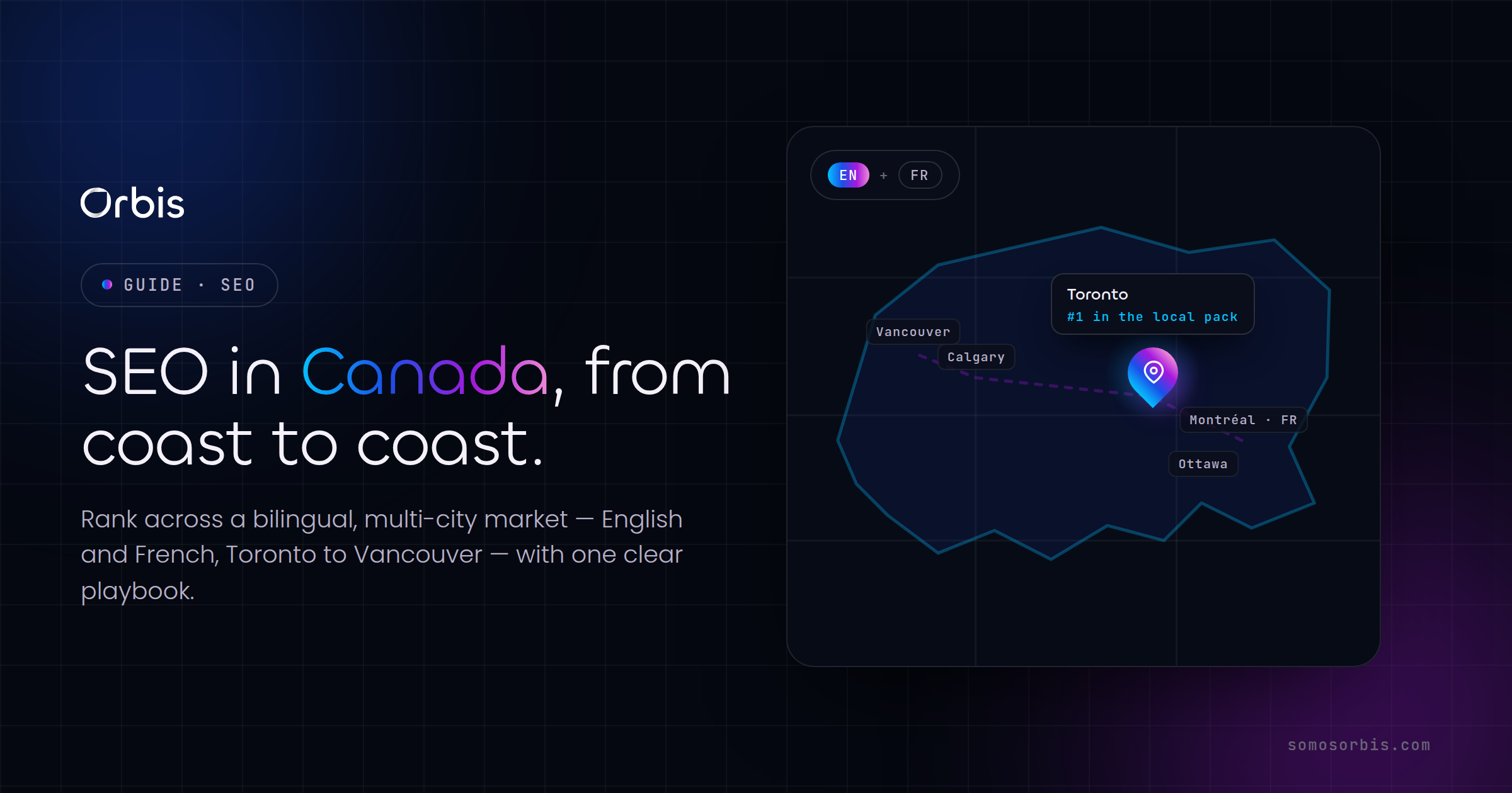
Canada is a uniquely demanding web market. You are selling to a bilingual population across six time zones, with buyers who research thoroughly, expect transparency on pricing in Canadian dollars, and abandon quickly when a site feels slow or untrustworthy. A website that performs well in a single-language, single-currency market often stumbles here because it ignores the realities of doing business from coast to coast.
Consider three pressures that shape Canadian web design specifically:
- Bilingual expectations. Even if you sell primarily in English, a meaningful share of your audience in Quebec, New Brunswick, and Ontario prefers French. A site that handles both languages cleanly signals that you take the whole country seriously, and it widens your reachable market without widening your ad spend.
- Trust and transparency. Canadian buyers are conservative researchers. They look for real reviews, clear contact details, physical presence, and honest pricing. A site that hides its prices or its location loses them before the first click.
- Seasonality and timing. Boxing Day, back-to-school in late August, the long holiday run from Black Friday through the new year, and regional patterns like ski season or cottage season all move demand. A website that cannot be updated quickly to reflect a seasonal campaign is leaving revenue on the table.
Good web design is not decoration. It is the discipline of turning these market realities into a structure, a message, and a user journey that move a visitor from curiosity to commitment.
The five types of websites Canadian businesses build
Before you brief a designer or sign a contract, you need to know which kind of project you are actually undertaking. The word "website" hides five very different builds, each with its own goals, budget range, and success metrics. Choosing the wrong type is the most expensive mistake we see, because it sends the entire project off in the wrong direction from day one.
1. Corporate websites
A corporate website is your digital headquarters. Its job is credibility: to explain who you are, what you do, who you serve, and why you can be trusted. For professional services firms, manufacturers, B2B suppliers, and established brands, this is usually the priority. It is less about immediate transactions and more about building the confidence that leads to a phone call, a quote request, or a long sales cycle. A strong corporate site is well-structured, fast, clearly written, and rich with the proof points that Canadian buyers look for. We cover this in depth in our dedicated guide to corporate website design in Canada, and you can see the build approach on our corporate web design service page.
2. Custom web platforms and applications
Some businesses outgrow templates. When your operation depends on a booking engine, a client portal, a quoting tool, an inventory system, or any workflow that off-the-shelf software cannot handle, you need custom development. This is the most technically involved category, and it demands a partner who can engineer reliable software rather than simply style pages. The payoff is a digital product that becomes a genuine competitive advantage. Our guide to custom web development in Canada explains when this investment makes sense and how to scope it without runaway costs.
3. E-commerce stores
If you sell products online, your website is your storefront, your cashier, and your warehouse window all at once. E-commerce design is its own discipline: product discovery, cart psychology, checkout friction, payment options Canadians actually use, shipping clarity, and returns policy all directly affect revenue. A beautiful store that loses customers at checkout is a failure no matter how good it looks. Explore our e-commerce web design service and read the detailed walkthrough in our guide to e-commerce website design in Canada.
4. Landing pages
A landing page is a single, focused page built to do one thing: convert traffic from a specific campaign into a specific action. Unlike a full website, it removes distractions, sharpens the message, and points everything toward one call to action. For paid advertising, product launches, and seasonal promotions, a dedicated landing page routinely outperforms sending traffic to a homepage. Learn the mechanics in our guide to landing page design for conversions.
5. Platform-based sites: WordPress and Shopify
Many Canadian businesses build on established platforms rather than from scratch, and that is often the smart choice. WordPress powers a huge share of content-driven and corporate sites because it is flexible, well-supported, and easy to update. Shopify dominates Canadian e-commerce because it handles payments, taxes, and shipping out of the box. The platform you choose shapes your costs, your flexibility, and your long-term maintenance. We compare the trade-offs in our guides to building a WordPress website in Canada and designing a Shopify store in Canada.
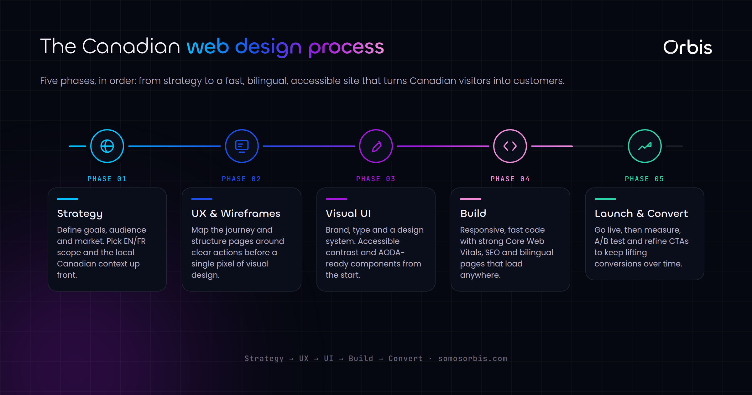
Planning your website: the work that happens before design
The most common reason web projects fail is that they skip planning and rush to visuals. Design decisions made without a strategy are just opinions, and opinions are expensive to revise once they are coded. Spend real time on the four planning pillars below and the rest of the project becomes dramatically smoother.
Define the single primary goal
Every website needs one dominant purpose. Is it to generate qualified leads, to sell products directly, to book consultations, or to establish authority for a longer sales cycle? You can have secondary goals, but you cannot have five primary ones. When everything is a priority, nothing is, and the design tries to do too much and persuades no one. Write your primary goal in a single sentence and pin it to every decision that follows.
Map your audience and their journey
Picture the specific Canadian buyer you are trying to reach. What question is in their head when they arrive? What objection will stop them? What proof will reassure them? Map the path from the moment they land to the moment they act, and design each step to answer the next question they are likely to ask. A site that anticipates objections converts far better than one that simply lists features.
Plan your site architecture
Site architecture is the skeleton of your website: how pages relate, how navigation flows, and how a visitor or a search engine finds what they need. Good architecture is shallow and logical, so any page is reachable in two or three clicks. It groups related content into clear sections and uses internal links to connect them, which helps both humans and search engines understand your site. Get this right early; restructuring later is painful.
Prepare your content and proof points
Content is not something you sprinkle on at the end. It is the substance of the site, and it should be ready before design begins. Gather your value proposition, your service descriptions, your real customer reviews, your credentials, and any partnerships or recognitions you can legitimately cite. Canadian buyers respond strongly to concrete proof: genuine star ratings, verifiable client counts, named partners, and clear evidence of experience.
Budgeting realistically
Budget conversations derail more Canadian web projects than any technical issue. The honest truth is that website cost is a function of complexity, not page count. A focused corporate site with strong copy and clean design occupies one tier; a custom platform with integrations, user accounts, and bespoke workflows occupies another entirely. Before you ask for a quote, decide what the website must achieve in revenue or leads, and let that target frame what a sensible investment looks like. A site that generates qualified leads every week justifies a very different budget than a digital business card. Beware of quotes that seem too good to be true; they usually omit the strategy, content, testing, and post-launch support that actually make a site convert. Plan for the total cost of ownership, including hosting, maintenance, and ongoing improvement, not just the build.
The anatomy of a high-converting website
Once planning is done, certain elements consistently separate websites that convert from websites that merely exist. The following components are not optional extras; they are the load-bearing walls of a site that earns its keep.
A clear, benefit-led message above the fold
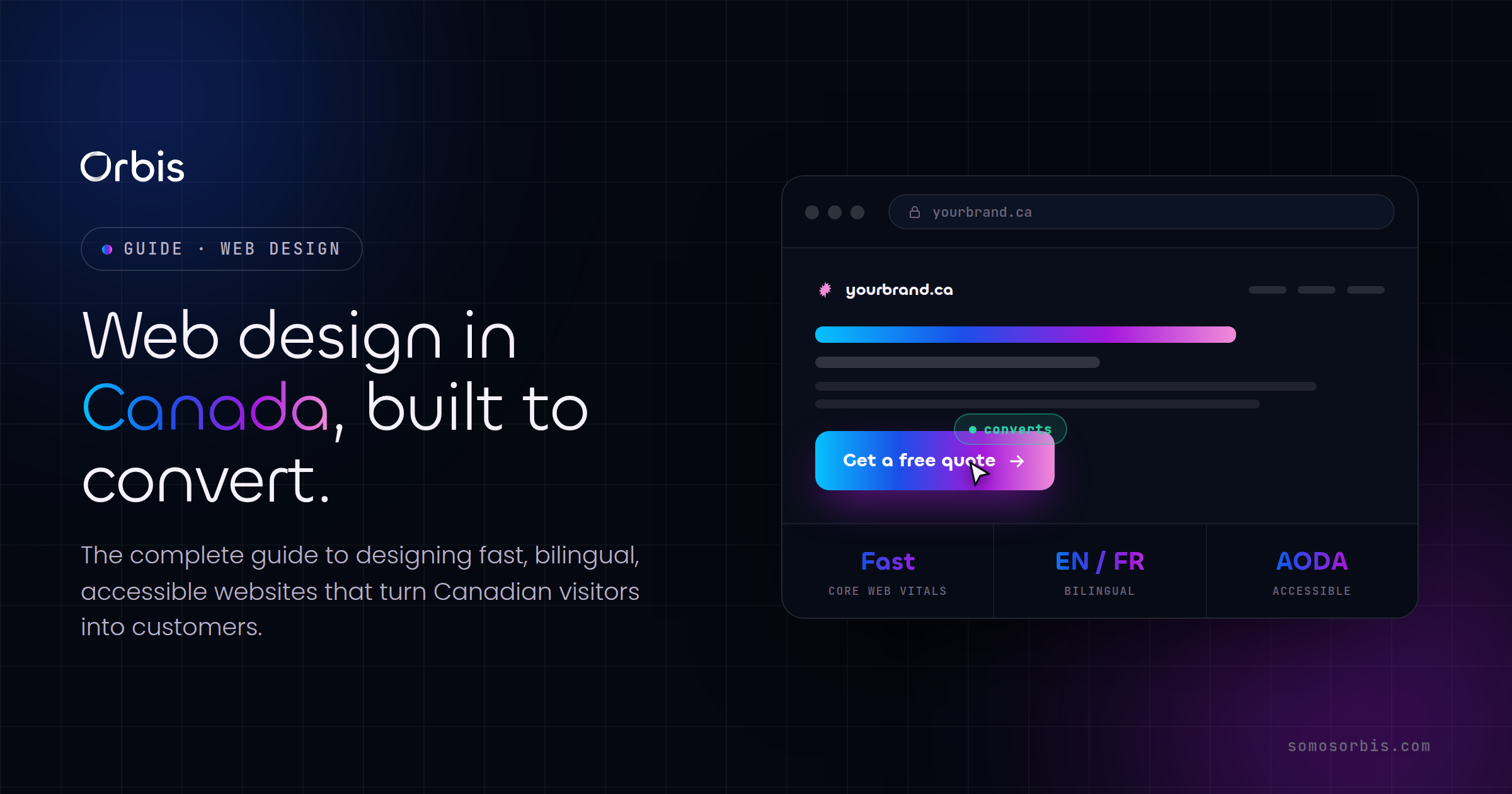
The first screen a visitor sees must answer three questions in seconds: what do you offer, who is it for, and why should I care? A vague tagline wastes this priceless real estate. Lead with the outcome you deliver, not a description of your company. The strongest headlines speak to the buyer's goal, supported by a subheadline that adds specificity and a single obvious call to action.
Frictionless navigation
Navigation should be invisible in the best sense: visitors find what they need without thinking about it. Keep the main menu short, label items in plain language rather than clever jargon, and make sure the most important action is always within reach. On a corporate site, "Contact" or "Get a quote" should never be hard to find. Confusing navigation is one of the fastest ways to lose a Canadian buyer who is comparing several vendors at once.
Trust signals throughout
Trust is earned in increments across the page. Place proof where doubt arises: reviews near your pricing, credentials near your claims, security badges near your checkout, and contact details everywhere. For Canadian audiences, displaying that you have served hundreds of clients over many years, that you hold recognized partner statuses, and that real customers rate you highly does more persuasive work than any adjective you could write about yourself.
Performance and speed
Speed is conversion. A site that takes more than a few seconds to load bleeds visitors, and the effect is worse on mobile connections outside major metros. Compress images, minimize heavy scripts, choose reliable hosting, and test on real devices. Performance is also a ranking factor, so a fast site is both more persuasive and more discoverable. Treat every second of load time as a percentage of revenue.
Mobile-first design
The majority of Canadian web traffic is now mobile, and for many consumer categories it is the overwhelming majority. Designing for the phone first forces clarity: if your message and your call to action work on a small screen, they will work everywhere. Tap targets must be large, forms must be short, and content must be scannable. A desktop-only mindset is a relic, and it costs sales every day.
Conversion-focused calls to action
Every page should make the next step obvious. A call to action is a promise of value, not a command, so write it in terms of what the visitor gets: "Get your free quote," "Book a consultation," "Start your order." Use contrasting buttons, repeat the primary action down long pages, and remove competing links that pull attention away from the goal.
Designing for the Canadian market specifically
General best practices get you most of the way, but the details that win in Canada are local. Here is where a generic build and a Canada-ready build diverge.
Bilingual and localization considerations
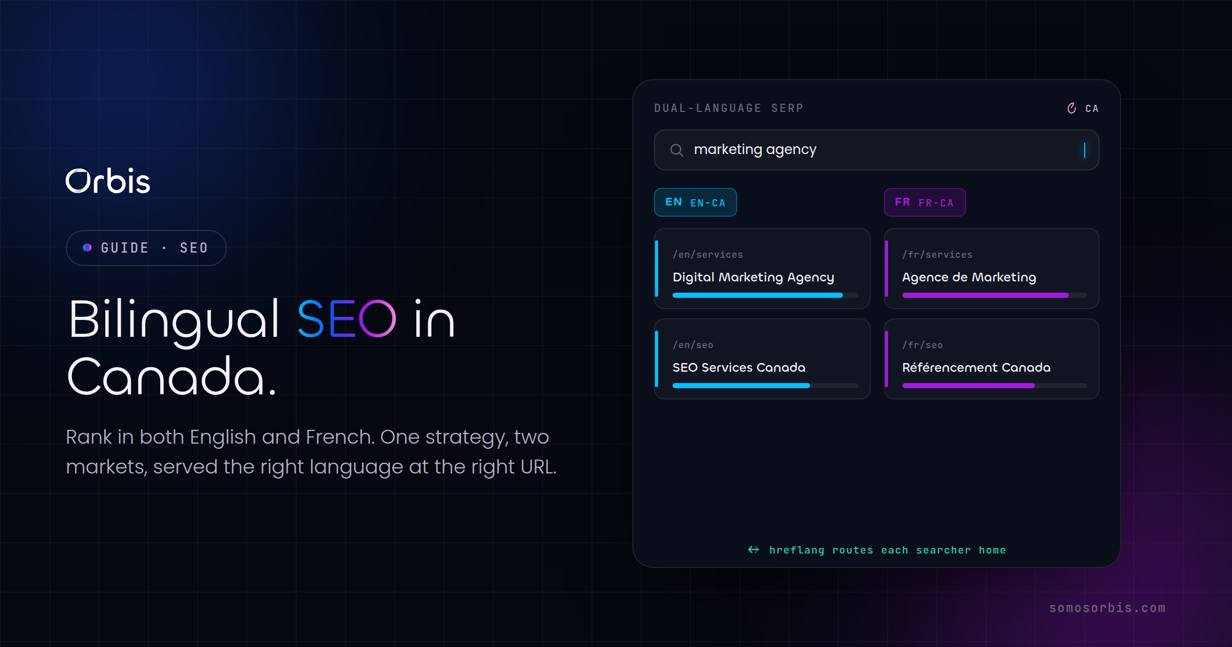
If French-speaking customers are part of your market, plan for bilingual content from the start rather than bolting it on later. This affects your architecture, your URL structure, and your content workflow. Even small touches matter: spelling conventions, date formats, and tone should feel native rather than machine-translated. A genuinely bilingual site signals respect and broadens your funnel across Quebec and beyond.
Currency, taxes, and payment methods
Show prices in Canadian dollars, account for provincial sales taxes correctly, and offer the payment methods Canadians actually reach for, including Interac where relevant alongside major cards and digital wallets. For e-commerce, surprise costs at checkout are the leading cause of cart abandonment, so be transparent about shipping and taxes early in the journey rather than at the final step.
Seasonality and campaign agility
Canadian retail and B2B demand swings with the calendar. Your site should make it easy to launch a Boxing Day promotion, a back-to-school push, or a holiday campaign without rebuilding pages from scratch. Build with reusable sections and a content workflow that lets your team update banners, offers, and landing pages in hours, not weeks. The businesses that win the seasonal moments are the ones that can move quickly when demand spikes.
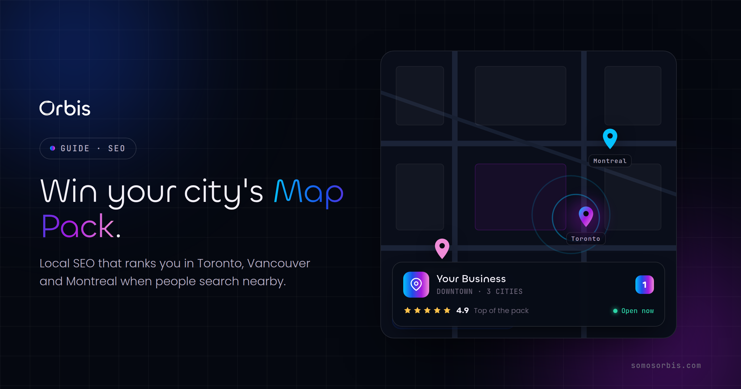
Local SEO and discoverability
For many Canadian businesses, being found means being found locally. Structure your site so search engines understand where you operate and what you serve, use clear location signals, and keep your business information consistent across the web. Combine that with genuinely useful content and a fast, well-architected site, and you give yourself the foundation to rank for the searches that bring qualified buyers to your door.
Accessibility as a baseline, not an afterthought
Accessibility is both an ethical obligation and a commercial advantage in Canada, where a significant portion of the population lives with a disability and where accessibility expectations are rising across jurisdictions. An accessible website uses sufficient colour contrast, supports keyboard navigation, provides descriptive alternative text for images, structures content with proper headings, and ensures forms are usable with assistive technology. The happy reality is that accessible design is almost always better design for everyone: clearer typography, simpler navigation, and more logical structure benefit every visitor, not only those using screen readers. Build accessibility into your standards from the first wireframe and you avoid the expensive, demoralizing exercise of retrofitting it after launch.
Privacy and data responsibility
Canadian buyers care about how their data is handled, and businesses that collect personal information carry real responsibilities to protect it and to be transparent about its use. Make your privacy practices clear, request only the data you genuinely need, secure your forms and checkout, and give visitors confidence that their information is in careful hands. A trustworthy data posture is not just compliance housekeeping; it is a conversion factor, because a hesitant buyer who senses sloppiness with data will simply leave. Treat respect for the visitor's privacy as part of the brand promise your website makes.
Choosing the right platform and partner
The platform decision shapes everything downstream: your costs, your flexibility, your maintenance burden, and how quickly your team can make changes. There is no universally correct answer, only the right fit for your goals.
- WordPress suits content-rich corporate sites, blogs, and businesses that want to update pages frequently without a developer. It is flexible and widely supported, though it benefits from disciplined maintenance and security hygiene.
- Shopify is the default for most Canadian online stores because it handles payments, taxes, shipping, and inventory reliably, freeing you to focus on selling rather than infrastructure.
- Custom development is warranted when your business logic is genuinely unique and no platform fits. It costs more upfront but can become a durable competitive advantage.
- Landing page builders and lightweight stacks work well for campaign-specific pages where speed of launch matters most.
Choosing a partner matters as much as choosing a platform. Look for a team that asks about your business goals before talking about visuals, that can show real experience, that builds for performance and conversion rather than awards, and that will still be reachable after launch. A website is not a one-time purchase; it is a living asset that needs iteration as your business and the market evolve.
From launch to growth: what happens after you go live
Launch is the starting line, not the finish. The best websites improve continuously based on real data about how visitors behave. A few disciplines separate sites that get better over time from sites that quietly decay.
- Measure what matters. Track the actions that map to your primary goal, not vanity metrics. Know your conversion rate, where visitors drop off, and which pages do the heavy lifting.
- Test and iterate. Small, evidence-based changes to headlines, calls to action, and page structure compound over time. Treat your site as a hypothesis to be refined, not a monument to be admired.
- Keep content fresh. Search engines and buyers both reward sites that stay current. Update your proof points, refresh seasonal content, and add genuinely useful resources.
- Maintain security and performance. Keep platforms updated, monitor speed, and fix issues before they cost you. Neglected sites slow down, break, and lose trust.
Related guides for every kind of website
This pillar gives you the big picture. When you are ready to go deeper on a specific build, these focused guides take you the rest of the way:
- Corporate website design in Canada — building credibility and generating leads for established businesses.
- Custom web development in Canada — when off-the-shelf is not enough and you need bespoke software.
- E-commerce website design in Canada — turning a storefront into a revenue engine.
- Landing page design for conversions — single-purpose pages that maximize campaign return.
- WordPress website in Canada — the flexible platform for content-driven sites.
- Shopify store design in Canada — the e-commerce platform built for selling.
Bringing it all together
A high-converting website is never an accident. It is the product of a clear goal, a deep understanding of the Canadian buyer, a deliberate architecture, persuasive and honest content, fast and mobile-first design, and a commitment to improving after launch. Get those fundamentals right and your website stops being a cost centre and becomes one of the hardest-working assets in your business, generating leads and sales around the clock across every province and time zone.
The difference between a website that looks fine and a website that drives revenue usually comes down to execution and experience. With more than fifteen years building for over five hundred clients, a 4.9-star rating from real reviews, and partnerships with the platforms Canadian businesses rely on, our team builds sites engineered to convert, not just to impress. We work with documented processes and compliance built in from the start, so your project is predictable, accountable, and aligned with current regulations.
Your website should pay for itself. If yours is not generating the leads and sales it should, the problem is rarely effort and almost always strategy and execution.
Ready to build a website that actually converts? Explore our web design services in Canada and let us turn your site into your most reliable source of growth.