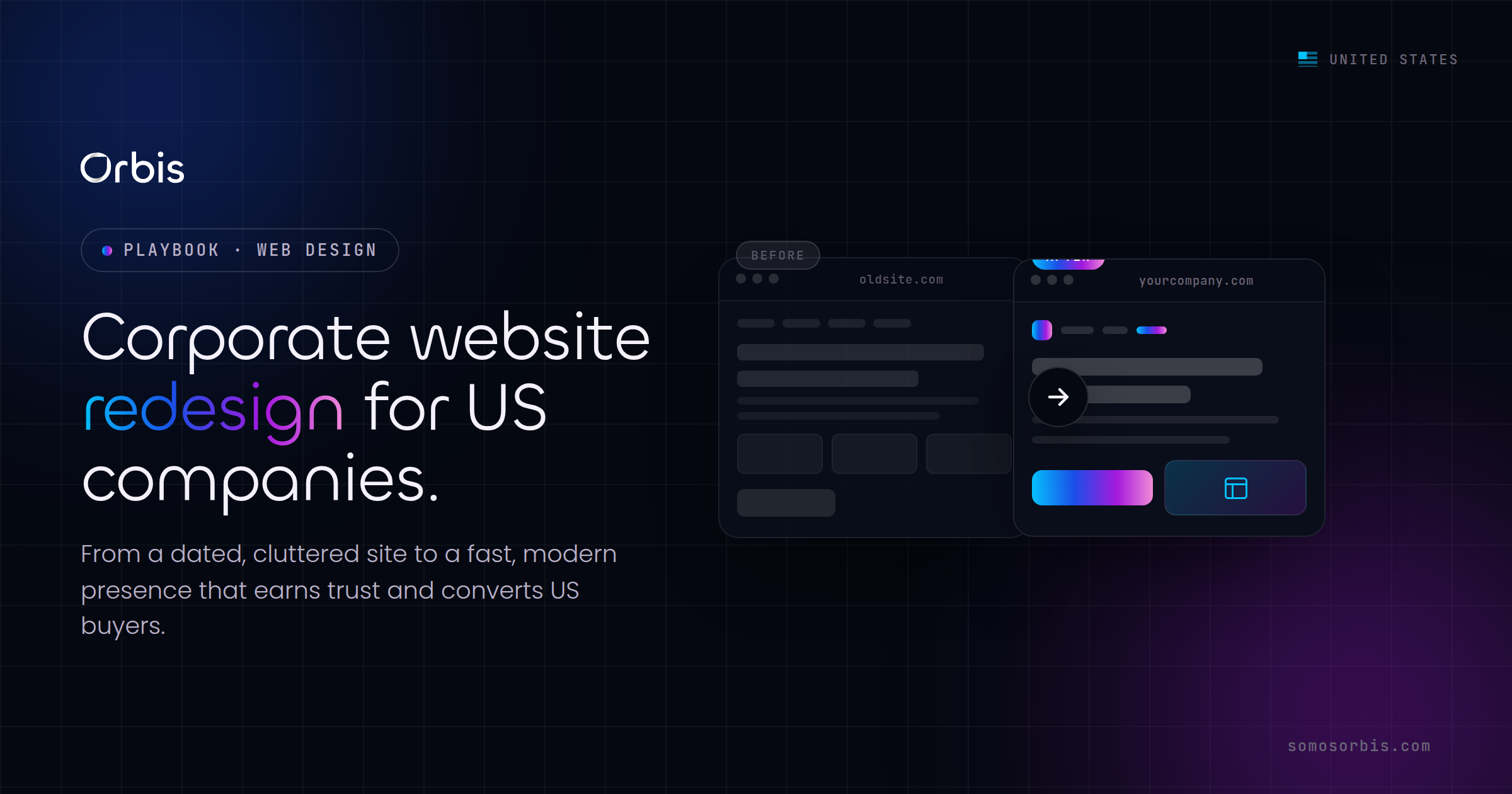
Your corporate website is the first handshake your company offers a prospect in New York, Los Angeles, Chicago, Miami, Dallas, or Houston. If that handshake feels dated, slow, or hard to navigate, the deal quietly cools before a salesperson ever picks up the phone. For US companies competing in crowded markets, a corporate website redesign is not a cosmetic refresh. It is a revenue project disguised as a design project, and it should be planned, budgeted in USD, and measured like one.
At Orbis we have spent more than 15 years helping over 500 clients turn their sites into engines that build trust and generate qualified leads. As a Google Partner with a 4.9-star rating across 58 reviews, we approach redesigns with documented processes, revenue engineering, and compliance by design. This guide walks you through how to plan a corporate redesign that improves trust, accessibility, and lead generation, with quality processes and clear, USD-driven calls to action that move buyers forward.
Why US companies outgrow their corporate websites
Most corporate sites do not fail in a single dramatic moment. They erode. A page is added here, a campaign landing page is bolted on there, a new product line gets a section that never matched the rest, and three years later the experience feels like a building with five different architects. Buyers notice. In the US market, where a procurement lead in Dallas can compare four vendors before lunch, an inconsistent or sluggish site reads as an inconsistent or sluggish company.
The clearest signals that your corporate website has outgrown its current form include:
- Declining conversion despite stable traffic. Visitors arrive but do not request demos, download resources, or fill out contact forms.
- Mobile experience that fights the user. A growing share of US B2B research starts on a phone during a commute or between meetings, and pinch-to-zoom navigation is a dealbreaker.
- Slow load times. Every additional second of load time pushes bounce rates higher, especially on the cellular connections common across Miami, Houston, and Los Angeles.
- Content you are embarrassed to share. If your sales team avoids linking to certain pages, those pages are costing you trust.
- No clear path to the next step. If a prospect cannot tell what to do in five seconds, your site is working against your pipeline.
If two or more of these describe your situation, a redesign is no longer optional. The question becomes how to do it without breaking what already works.
Start with goals, not templates
The most expensive mistake in corporate redesigns is choosing a look before defining a job. A beautiful site that does not generate leads is a liability with good typography. Before any visual decisions, agree internally on what the redesign must accomplish, in measurable terms.
Set targets you can defend in a budget meeting:
- Lead volume: increase qualified form submissions or demo requests by a specific percentage within two quarters.
- Conversion rate: move from your current visitor-to-lead rate to a defined target.
- Cost per lead in USD: reduce the blended cost of acquiring a lead so paid campaigns stretch further.
- Sales-cycle support: equip the site with case content, proof, and self-serve answers that shorten deal cycles.
When goals are explicit, every later decision becomes easier. Should the homepage hero be a video or a value statement? Whichever earns more demo requests. Should you keep the long services page or split it? Whichever produces more qualified leads. Goals turn subjective debates into testable choices. For a broader strategic foundation, our complete web design guide for US businesses in 2026 lays out how design priorities connect to business outcomes across the entire site, not just the homepage.
Build trust deliberately, because US buyers verify everything
Trust is the currency of B2B and high-consideration B2C in the United States. A buyer in Chicago evaluating a six-figure contract will cross-check your claims, scan for proof, and look for reasons to disqualify you. A redesign is your chance to remove those reasons.
Make proof impossible to miss
Generic reassurance does nothing. Specific, verifiable proof does the work. Surface the evidence a skeptical buyer wants:
- Real client logos and the industries you serve, placed where they support the buying decision.
- Quantified outcomes and testimonials with names and roles, not anonymous quotes.
- Recognizable partnerships and certifications that signal you operate at a professional standard.
- A clear, human About section that shows the team and the years of experience behind the work.
At Orbis, our own proof points such as a Google Partner badge, a 4.9-star rating across 58 reviews, and partnerships with platforms like Meta, Shopify, Kommo, Zapier, Pinterest, Spotify, and others appear because they are real and verifiable. Your redesign should treat your proof the same way: front and center, never invented, always defensible.
Design for credibility, not decoration
Credibility comes from clarity. Consistent spacing, a disciplined color system, legible typography, and predictable navigation tell a buyer that the company behind the site is organized and reliable. Visual chaos, on the other hand, signals operational chaos, fairly or not. A corporate redesign is where you bake credibility into every component so it scales across hundreds of pages without drifting.
Accessibility is trust, compliance, and reach at once
Accessibility is often treated as a checkbox at the end of a project. That is backwards. For US companies, accessibility is simultaneously a trust signal, a legal-risk reducer, and a way to reach more of your audience. Building to recognized standards such as WCAG from the start is far cheaper than retrofitting later, and it protects you under the normativa vigente that US organizations are expected to meet.
Bake these accessibility practices into the redesign brief:
- Color contrast that remains readable for users with low vision, verified against contrast ratios rather than eyeballed.
- Keyboard navigation so every interactive element works without a mouse.
- Descriptive alt text on meaningful images and proper labels on every form field.
- Logical heading structure that screen readers can follow from top to bottom.
- Captions and transcripts for video content, which also boosts how that content is discovered.
There is a market reason beyond compliance. The United States has a large and growing Hispanic audience, and many US companies serve customers who move fluidly between English and Spanish. Where it fits your audience, a bilingual EN/ES experience widens your reach and signals that you see your customers clearly. Accessibility and language inclusivity are two sides of the same idea: removing friction so more qualified people can become customers.
Engineer the site for lead generation
A corporate redesign should be judged by the pipeline it produces, not the compliments it collects. That means designing the path from anonymous visitor to qualified lead with the same rigor you apply to a sales process.
Make calls to action unambiguous and USD-aware
Every key page needs one obvious next step. Avoid stacking five competing buttons that split attention. Instead, lead with a single primary action, supported by a quieter secondary option for buyers who are not ready. Where pricing or value is involved, anchor it in USD so a CFO in Houston can evaluate the offer without translating numbers in their head. Clarity about cost and outcome reduces hesitation.
Strong corporate CTAs share a few traits:
- They describe the value, not the mechanics. "Get your free site audit" beats "Submit."
- They reduce perceived risk with words like free, no commitment, or quick.
- They appear at natural decision points, not only at the bottom of the page.
- They lead to short, friction-light forms that ask only for what you truly need.
Plan content around the buyer's questions
US buyers self-educate before they ever talk to sales. Your redesign should answer their questions in the order they ask them: what you do, who you have done it for, how it works, what it costs in USD, and why you over the alternatives. When a prospect can resolve their own objections on your site, they arrive at the sales conversation warmer and closer to a decision. One foundational decision that shapes this whole content layer is your build approach. Our breakdown of custom web development versus templates for US businesses explains when a flexible custom foundation is worth the investment and when a template will quietly limit your growth.
Protect your traffic and rankings during the migration
The fastest way to turn a successful redesign into a crisis is to launch it and watch organic traffic collapse. Redesigns frequently change URLs, restructure navigation, and consolidate pages. Without careful planning, search engines lose the trail and your hard-won rankings evaporate, taking your inbound leads with them.
Protect your equity with a disciplined pre-launch process:
- Crawl and inventory every existing URL and its traffic and conversion value before touching anything.
- Map old URLs to new ones with proper 301 redirects so authority transfers instead of disappearing.
- Preserve high-performing content rather than rewriting pages that already rank and convert.
- Keep titles, headings, and internal links aligned with the terms your customers actually search.
- Stage and test the new site privately, then monitor analytics and search performance closely for the first weeks after launch.
This is exactly the kind of work that benefits from documented processes. When the migration plan lives in a checklist that the whole team follows, nothing slips through the cracks during the high-pressure launch window.
Respect privacy and data expectations by design
US customers are increasingly conscious of how their data is collected and used, and a corporate redesign is the right moment to get this right. Compliance by design means building privacy expectations into the site from the first wireframe rather than patching them in after launch.
Practical steps that respect US privacy norms without over-engineering:
- Be transparent about what data your forms collect and why.
- Give users clear, honest choices about tracking and communications.
- Keep an accessible, plain-language privacy policy linked where users expect it.
- Collect only the data you genuinely need to serve the customer and qualify the lead.
Handling data respectfully is not just risk management. It is trust. A buyer who sees you treating their information carefully extends that judgment to how you will treat them as a client.
Time the launch around your revenue calendar
US business runs on a seasonal rhythm, and your redesign timeline should respect it. Launching a major site change days before a peak period is a gamble few teams should take. Instead, align the rollout with the moments that matter for your industry.
- Retail and DTC: finish and stabilize well before Black Friday, Cyber Monday, and Amazon Prime Day, never during them.
- Education-adjacent and family services: account for the back-to-school surge in late summer.
- Financial and professional services: avoid disruptive changes during tax season when demand and scrutiny peak.
Launching in a quieter window gives your team room to monitor performance, fix issues, and optimize before the next high-stakes season arrives. The goal is to enter your busiest period with a proven, stable site, not a brand-new one full of unknowns.
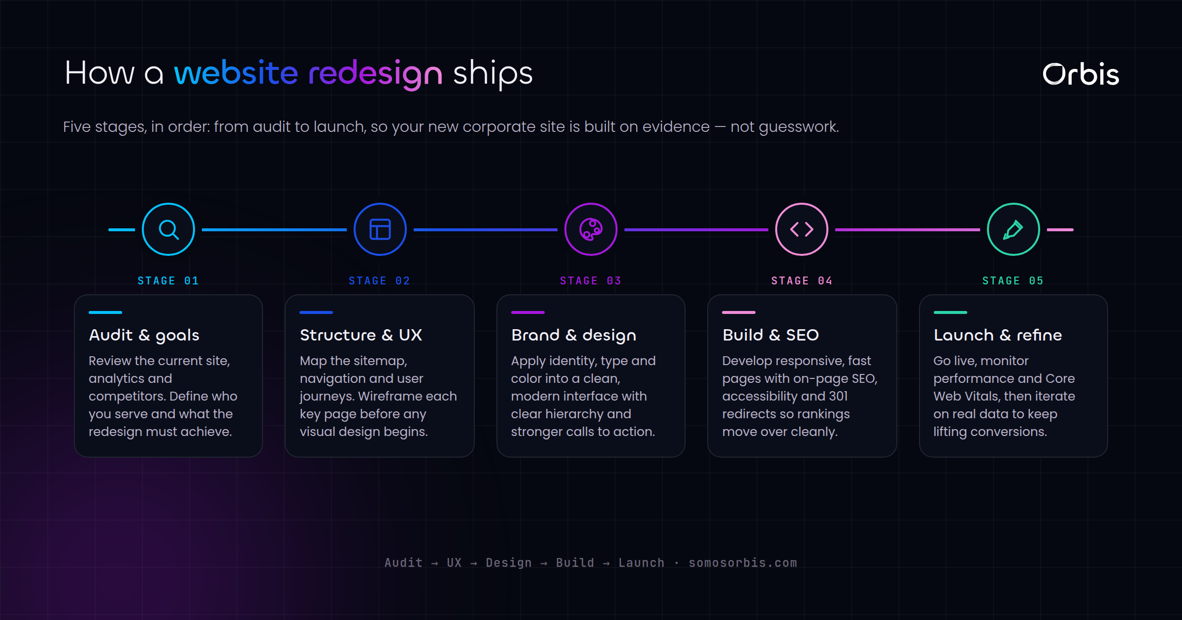
Phasing the project so it ships without chaos
A corporate redesign feels overwhelming when treated as one giant launch. Breaking it into phases keeps momentum and reduces risk:
- Discovery and goals: define metrics, audit the current site, and inventory content and URLs.
- Architecture and content: design the navigation, page structure, and messaging around buyer questions.
- Design and build: create a consistent, accessible component system and assemble the pages.
- Migration and QA: map redirects, test accessibility and performance, and verify on real devices.
- Launch and optimize: ship in a low-risk window, then measure against your goals and improve continuously.
This phased approach is where Business Assurance shows its value. Documented processes keep every phase accountable, revenue engineering keeps the project tied to pipeline rather than vanity, and compliance by design keeps accessibility and privacy from becoming afterthoughts.
Ready to redesign with revenue in mind?
A corporate website redesign done well pays for itself in trust earned, leads captured, and deals shortened. Done poorly, it drains budget and momentum. The difference is planning: clear goals, deliberate trust signals, built-in accessibility, lead-focused CTAs anchored in USD, a careful migration, and smart timing around your revenue calendar.
If you want a partner who treats your redesign as the revenue project it is, explore our corporate web design services and let us help you build a site that US buyers trust and act on. With over 15 years of experience, more than 500 clients served, and documented processes behind every engagement, Orbis is ready to turn your corporate website into your hardest-working salesperson.