Your website is the hardest-working asset your business owns. It runs 24/7 across every timezone from New York to Los Angeles, it never calls in sick, and for most US buyers it is the very first interaction they have with your brand. Yet too many companies treat web design as a one-time cosmetic project instead of what it actually is: a revenue engine that has to convert traffic into customers and earn rankings in an increasingly competitive search landscape.
This is the complete web design playbook for US businesses in 2026. Whether you run a B2B services firm in Chicago, a direct-to-consumer brand shipping nationwide, or a multi-location retailer in Dallas and Houston, the principles below will help you build a site that loads fast, ranks well, speaks to both English and Spanish-speaking audiences, and turns visitors into revenue. We will cover strategy, the major site types, conversion design, technical performance, SEO, accessibility, privacy, and how to budget the whole thing in USD.
Why web design is a business decision, not a design decision
Founders often delegate the website to whoever is cheapest or whoever "knows design." That is a mistake. Your site sits at the intersection of marketing, sales, and operations. A poorly built site quietly leaks money: slow pages bleed paid-ad budget, confusing navigation buries your best offers, and a checkout that breaks on mobile loses sales you already paid to acquire.
Consider the math. If you spend on Google Ads or Meta to drive 10,000 visitors a month and your site converts at 1.5% instead of a healthy 3%, you are leaving roughly half your potential revenue on the table without changing a single dollar of ad spend. Web design is the multiplier that sits behind every other marketing investment you make.
At Orbis we approach this through what we call Business Assurance: documented processes so your site is built the same disciplined way every time, revenue engineering so design choices are tied to measurable outcomes, and compliance by design so privacy and quality standards are baked in from day one rather than bolted on after a problem. The point is simple. A website should be accountable to the business, not just admired by the design team.
The questions to answer before any pixels are drawn
- Who is the primary visitor? A CFO evaluating a vendor behaves nothing like a shopper hunting a Black Friday deal. Design for the real person.
- What is the single most valuable action? Book a demo, request a quote, add to cart, download a guide. Every page should push toward one clear next step.
- How will you measure success? Define conversion events before launch, not after.
- Do you need bilingual EN/ES? For brands reaching the large US Hispanic market, a thoughtfully localized Spanish experience is not a nice-to-have, it is a growth lever.
The main types of websites and how to choose
"I need a website" can mean five very different projects. Getting the type right up front saves you from rebuilding six months later. Here is how the major categories break down for US businesses.
Corporate and brand websites
If your goal is credibility, lead generation, and a clear explanation of what you do, you are building a corporate site. These are the sites that win trust with finance directors, procurement teams, and enterprise buyers who research carefully before they ever fill out a form. The design priorities are clarity, proof, and a frictionless path to contact. A strong corporate web design balances polished brand storytelling with hard conversion mechanics: visible phone numbers, sticky contact CTAs, case studies, and trust signals like reviews and partner badges.
For established companies, the most common project is not a brand-new site but a redesign of an aging one. If your current site was built years ago, predates mobile-first design, or no longer reflects your positioning, read our deep dive on a corporate website redesign for US companies before you start, because a redesign done wrong can tank rankings you spent years earning.
E-commerce stores
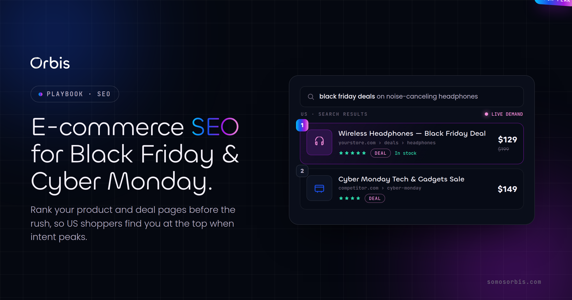
If you sell products online, you are in e-commerce, and the design stakes are higher because every friction point has a direct dollar cost. US shoppers expect fast load times, transparent shipping, multiple payment options including digital wallets, and a checkout that works flawlessly on a phone. Seasonality matters enormously here: your store has to survive the traffic spikes of Black Friday, Cyber Monday, Amazon Prime Day, back-to-school, and the post-holiday returns rush. We cover the conversion-specific tactics in our guide to e-commerce website design for US conversion.
The platform question looms large for stores. Many founders default to WordPress versus Shopify for US businesses without understanding the tradeoffs, and the right answer depends on your catalog size, fulfillment model, and team. A specialized e-commerce web design partner can help you pick the platform that fits rather than forcing your business to fit the platform.
Landing pages and campaign microsites
When you run a paid campaign, sending traffic to your homepage is a costly mistake. Campaign traffic needs a dedicated landing page with one message, one offer, and one action. These pages are where conversion rate optimization lives or dies, especially during high-spend windows like tax season or Prime Day. Our playbook on high-converting landing pages for US campaigns walks through the structure that consistently outperforms generic pages.
Custom builds versus templates
Templates and page builders get you live quickly and cheaply, which is perfect for early-stage validation. But as you scale, template constraints start to cost you: you cannot build the exact flow your funnel needs, performance suffers under plugin bloat, and you end up paying a designer to fight the template anyway. The decision between off-the-shelf and bespoke is nuanced, which is why we wrote a full comparison of custom web development versus templates for US businesses. As a rule of thumb: start with a template to validate, move to custom when the website becomes core to how you make money.
DTC and Shopify storefronts
Direct-to-consumer brands have a distinct design language: lifestyle photography, social proof front and center, subscription mechanics, and a brand voice that carries through every touchpoint. Shopify dominates this space for good reason, but a great Shopify store is far more than a theme you bought. Read our guide on Shopify store design for US DTC brands to see how custom theme work, app selection, and checkout optimization separate the brands that scale from the ones that stall.
Designing for conversion, not just for looks
A beautiful site that does not convert is an expensive piece of art. Conversion-centered design starts with a hard truth: visitors do not read, they scan. Within seconds they decide whether you understand their problem and whether you are worth their time. Your job is to make that decision easy and favorable.
The hierarchy of a converting page
- A clear headline above the fold that states the outcome you deliver, not a clever tagline. "Cut your fulfillment costs 30%" beats "Welcome to our website" every time.
- A subheadline that adds the how or the who, qualifying the right visitor.
- A primary call to action that is visually dominant and repeated as the visitor scrolls.
- Proof immediately after the promise: reviews, ratings, client logos, partner badges, real numbers.
- Objection handling through FAQs, guarantees, and clear pricing or "how it works" sections.
Trust signals that actually move US buyers
American consumers are skeptical and well-trained to spot fluff. Generic claims like "best in class" are ignored. What works is specific, verifiable proof. Display your real review count and star rating. Show recognizable partner relationships. Feature named case studies when you have permission. The credibility comes from specificity, so resist the urge to round up or embellish; a real 4.9-star average across dozens of reviews is more persuasive than a vague "thousands of happy customers."
The most common conversion mistake we see on US business sites is hiding the call to action below three screens of company history. Visitors came to solve a problem. Give them the path to solve it in the first thing they see.
Mobile-first is not optional
The majority of US web traffic is mobile, and for many consumer categories it is well over two-thirds. If your design starts on a desktop mockup and gets "squished" into mobile later, you have already lost. Design the mobile experience first: thumb-friendly buttons, single-column flows, tap targets large enough for real fingers, and forms short enough to complete one-handed on a train platform in Chicago or a coffee line in Miami.
Performance: speed is a feature
Page speed is one of the few things that affects both conversion and SEO simultaneously. Google measures real-world loading, interactivity, and visual stability through Core Web Vitals, and US shoppers abandon slow pages without hesitation. A one-second delay in load time can measurably reduce conversions, and the effect compounds when you are paying for the traffic.
The performance checklist
- Optimize and properly size images. Serve modern formats like WebP or AVIF, lazy-load below-the-fold media, and never ship a 4MB hero image to a phone.
- Use a CDN. Serving assets from edge locations close to your visitors in New York, Dallas, or Los Angeles cuts latency dramatically.
- Minimize third-party scripts. Every analytics tag, chat widget, and tracking pixel adds weight. Audit them ruthlessly.
- Prioritize above-the-fold content. Get the first meaningful paint on screen fast, then load the rest.
- Choose hosting that scales. Your Black Friday traffic spike is not the time to discover your server falls over.
Performance is also a budget conversation. A site built on a bloated template with twenty plugins will always be slower than a lean, purpose-built one. This is one of the strongest arguments in the custom-versus-template debate, and another reason to engineer performance in from the start rather than chasing it later.
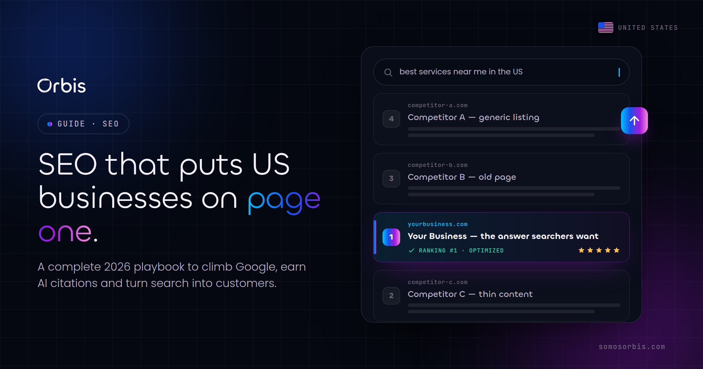
SEO and AI search: designing to be found
A site nobody can find is a brochure in a locked drawer. Web design and SEO are inseparable in 2026, because the structure, speed, and semantics of your site directly shape how both Google and AI answer engines understand and surface it.
On-page foundations
- Semantic HTML structure with a single clear H1 per page and a logical heading hierarchy that mirrors the content.
- Descriptive, keyword-aware titles and meta descriptions written for humans first and crawlers second.
- Clean, readable URLs that describe the page rather than expose database IDs.
- Internal linking that connects related pages so both visitors and crawlers can navigate your expertise. This very guide links to a cluster of related articles for exactly that reason.
- Structured data (schema markup) so search engines can render rich results and AI engines can extract clean facts.
Designing for AI answer engines
A growing share of US searches now end inside an AI-generated answer rather than a list of blue links. To get cited by these systems, your content needs to be clearly structured, factually specific, and easy to extract. Use descriptive headings phrased as the questions people actually ask, answer them directly in the first sentence, and back claims with concrete numbers and named entities. Well-structured pages with strong schema markup are far more likely to be surfaced as the source behind an AI answer.
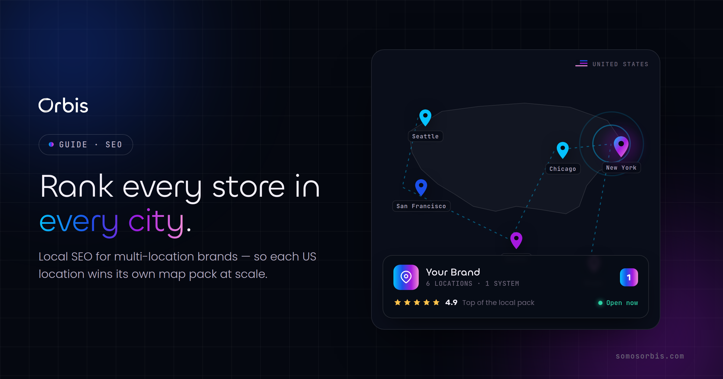
Local and bilingual SEO
If you serve specific metros, location pages and a well-maintained Google Business Profile matter. And for the large US Hispanic market, offering genuine Spanish-language pages, properly tagged with hreflang so search engines serve the right version, opens an audience your English-only competitors are ignoring. Bilingual EN/ES design is both a conversion and an SEO advantage when done with real localization rather than machine-translated afterthoughts.
Accessibility and inclusive design
Accessibility is the right thing to do, it expands your reachable audience, and it reduces legal exposure in the US, where accessibility-related demand letters and lawsuits have become common. Designing to recognized accessibility standards is simply good practice and good business.
- Sufficient color contrast so text is readable for low-vision users and in bright sunlight.
- Keyboard navigability so the entire site works without a mouse.
- Descriptive alt text on meaningful images for screen-reader users.
- Clear focus states and labeled form fields so assistive technology can guide users through.
- Captions and transcripts for video content.
The bonus: most accessibility improvements also improve SEO and usability for everyone. Clean structure, descriptive text, and logical navigation help screen readers and search crawlers alike.
Privacy and trust by design
US consumers are increasingly privacy-aware, and several states have enacted strong consumer privacy protections that affect how you collect and use data. Without over-engineering this, your web design should build trust through transparency: a clear, accessible privacy policy, honest cookie and tracking practices, a straightforward way for visitors to manage their data preferences, and consent handling that respects user choices.
This is part of what we mean by compliance by design. Rather than treating privacy as a legal afterthought, bake the right consent flows, data handling, and disclosures into the site architecture from the start. It protects the business, and it signals to customers that you take their data seriously, which itself is a conversion advantage in a skeptical market.
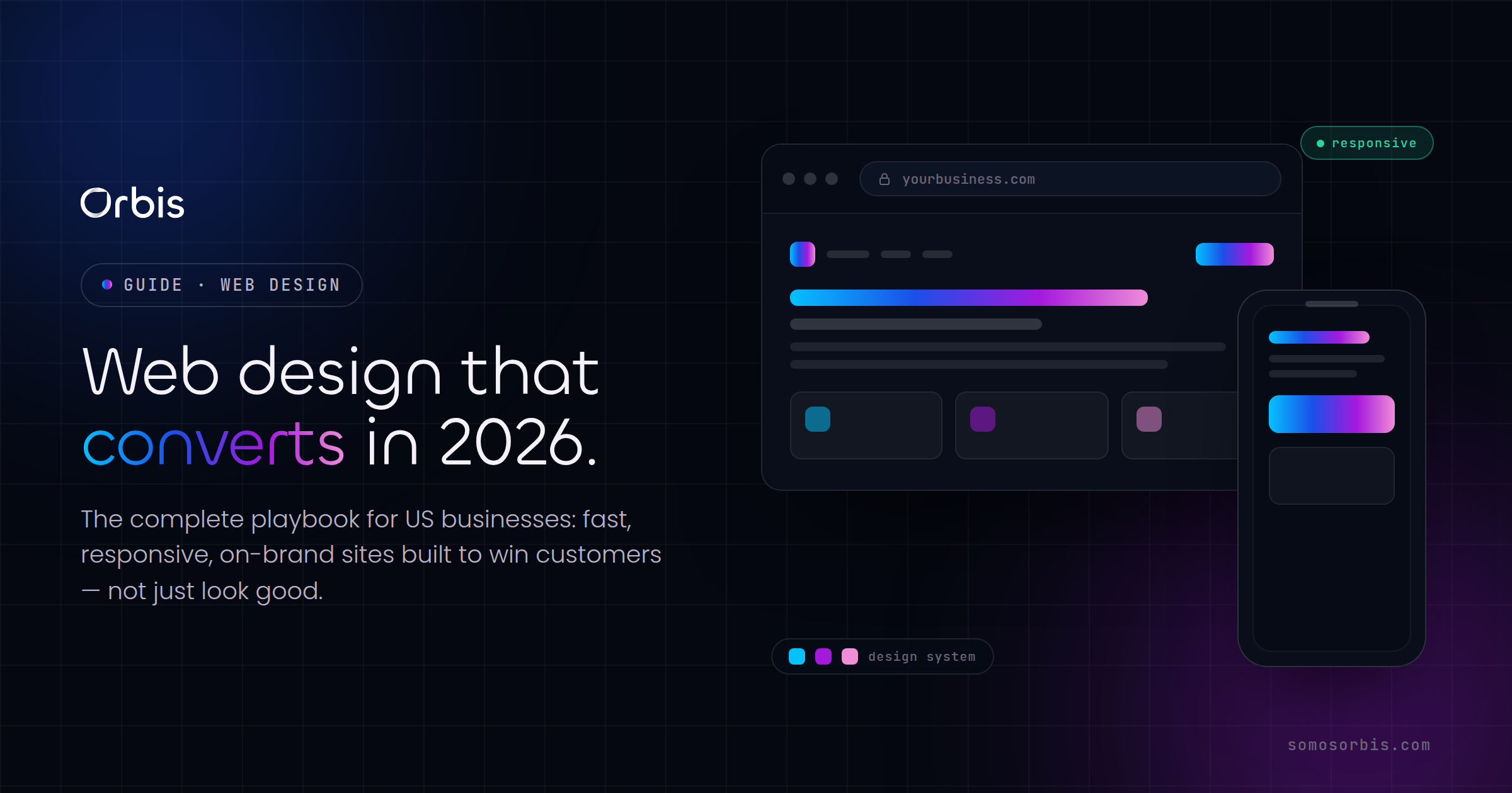
The content and design system that scales
A one-off site quickly becomes a maintenance headache. The businesses that win build a design system: a documented set of reusable components, type scales, color tokens, spacing rules, and content patterns. This keeps the site consistent as it grows, speeds up the creation of new pages and campaign landing pages, and lets multiple contributors work without the design drifting.
Content that supports the customer journey
- Top of funnel: educational content, guides, and tools that attract visitors who are not yet ready to buy.
- Middle of funnel: comparison pages, case studies, and detailed service or product pages that build the case.
- Bottom of funnel: pricing, demos, and frictionless contact or checkout flows.
This guide is itself a top-of-funnel pillar that connects to deeper, intent-rich articles. That is the model to copy: a strong central resource surrounded by focused pieces that each capture a specific search intent and route visitors toward your services.
Budgeting your web project in USD
Web design pricing in the US varies enormously, and the right number depends entirely on scope. Rather than chase the lowest bid, think in terms of return: a site that converts even a fraction of a percent better pays for itself many times over.
- Template-based small business site: the entry tier, fast to launch, suitable for validation and simple service businesses.
- Custom corporate or lead-gen site: mid tier, with bespoke design, copywriting, and conversion architecture tailored to your funnel.
- Custom e-commerce build: higher investment, reflecting catalog complexity, integrations, payment and fulfillment work, and seasonal scalability.
- Ongoing optimization: the smartest spend of all. Launch is the start, not the finish. Continuous testing and iteration is where the compounding returns live.
Beware the false economy of the cheapest possible build. A bargain site that loads slowly, fails on mobile, and cannot be found in search is not cheap; it is expensive in lost revenue you never see. Match the investment to how central the website is to your business model.
Common web design mistakes US businesses make
- Designing for the founder's taste instead of the customer's needs. Your opinion about the hero image matters far less than whether visitors convert.
- Burying the call to action. If a stranger cannot figure out the next step in five seconds, redesign.
- Ignoring mobile. Where most of your traffic lives is where most of your design effort should go.
- Skipping analytics. If you are not measuring conversions, you are guessing, and guessing is expensive.
- Launching and forgetting. The best sites are continuously refined based on real data.
- Treating Spanish as an afterthought. Half-hearted machine translation insults a valuable audience. Localize properly or not at all.
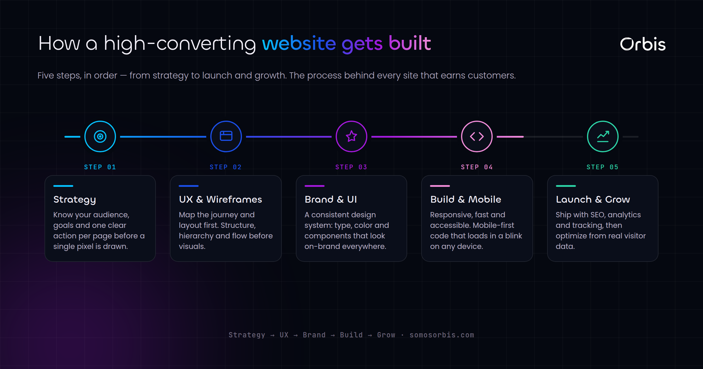
A practical launch roadmap
Here is the sequence we follow to take a US business from concept to a site that earns its keep.
- Discovery and strategy: define the audience, the primary conversion goal, and how success is measured.
- Information architecture: map the pages and navigation around how customers actually search and buy.
- Wireframes and design system: establish the components and patterns before polishing visuals.
- Content and copy: write conversion-focused copy, in both languages if you serve bilingual audiences.
- Build and integrate: develop with performance, accessibility, and SEO baked in, and connect analytics and CRM.
- Test before launch: across devices, browsers, and real traffic conditions, including peak-load scenarios for seasonal businesses.
- Launch and optimize: ship, then iterate continuously based on data.
Related guides in this web design series
This pillar is the hub of a complete web design library for US businesses. Explore the focused guides below to go deeper on the topic that matches your project:
- Corporate website redesign for US companies — how to modernize an aging site without losing rankings.
- Custom web development versus templates — when to build bespoke and when off-the-shelf is enough.
- E-commerce website design for US conversion — design tactics that lift online sales.
- High-converting landing pages for US campaigns — the structure that wins on paid traffic.
- WordPress versus Shopify for US businesses — choosing the right platform for your store.
- Shopify store design for US DTC brands — building a storefront that scales.
Build a website that works as hard as you do
Web design in 2026 is no longer about choosing pretty colors. It is about engineering an asset that loads fast, ranks well, speaks to every US audience including the Spanish-speaking market, respects privacy, and converts visitors into customers around the clock. The companies that treat their website as a revenue system rather than a brochure are the ones pulling ahead in New York, Los Angeles, Chicago, Miami, Dallas, Houston, and every market in between.
If you are ready to turn your website into your hardest-working salesperson, our team brings over fifteen years of experience, a Google Partner credential, a 4.9-star reputation across dozens of reviews, and a track record with more than 500 clients. Let's design something that delivers measurable results. Explore our web design services and let's build a site engineered to convert and rank.