In the United States, a beautiful store is table stakes. The brands that win in New York, Los Angeles, Chicago, Miami, Dallas, and Houston are the ones whose e-commerce design quietly removes friction at every step: product pages that answer the next question before it is asked, a checkout that loads fast on a phone in a parking lot, and trust signals that make a first-time buyer comfortable handing over a card in USD. Design is not decoration here. It is revenue engineering.
This guide breaks down how to design product pages, checkout flows, and trust signals that convert US shoppers, with practical attention to USD pricing clarity, mobile-first performance, and readiness for peak moments like Black Friday/Cyber Monday, Amazon Prime Day, back-to-school, and tax season. It is written for operators who want measurable conversion lift, not a redesign that just looks different.
Start with the US shopper's real buying context
The average US online buyer is comparison-shopping across tabs, often on mobile, frequently mid-task. They expect Amazon-grade clarity: a price they trust, a delivery date they can plan around, and a return policy that removes the fear of being wrong. If your design does not match those expectations within the first few seconds, the back button wins.
Three behavioral realities should shape every design decision:
- Mobile is the default, not the exception. A large share of US e-commerce traffic and a growing share of revenue happens on phones. Design for a 5.5-inch screen first, then scale up.
- Speed is a trust signal. US shoppers abandon slow pages without guilt. A one-second delay on a product page is a measurable revenue leak during high-intent traffic.
- The US Hispanic market is enormous and underserved. Tens of millions of bilingual shoppers in markets like Los Angeles, Houston, Miami, and Dallas respond to stores that meet them in English and Spanish. A simple EN/ES toggle on product and checkout pages can widen your addressable audience without rebuilding the catalog.
Before touching a layout, map your top three traffic sources and the intent behind each. A shopper arriving from a Black Friday email is different from one arriving from a back-to-school search. The design should flex to the context.
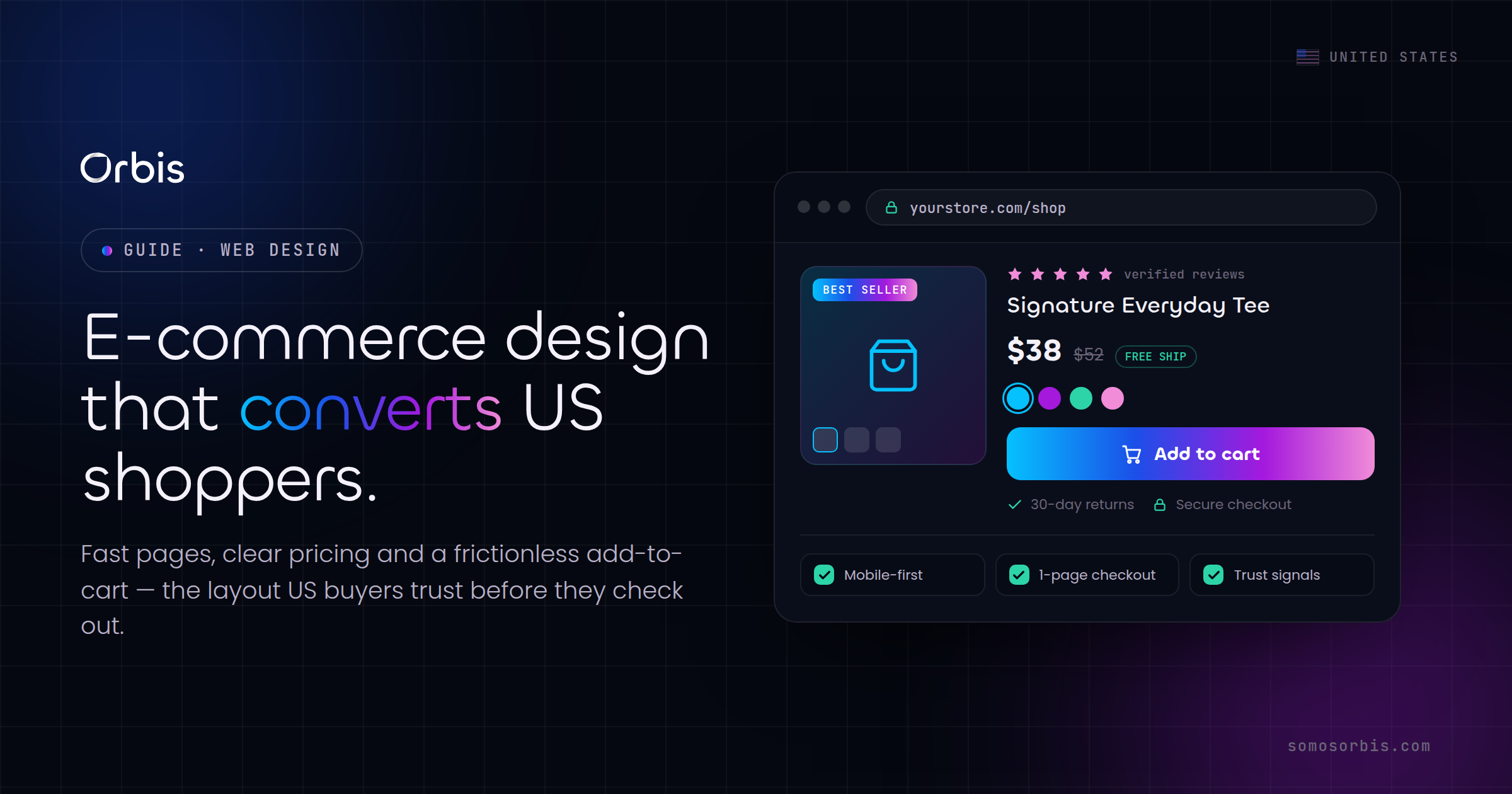
Design product pages that close the sale
The product page is where most conversion is won or lost. Its job is to answer every objection in the order a buyer thinks of them, then make the "add to cart" action feel obvious and safe.
Lead with clarity on price, value, and availability
US shoppers want zero ambiguity about cost. Show the USD price prominently, and if there is a sale, show the reference price next to it so the discount is legible. Avoid hidden surprises: if shipping, taxes, or fees apply, signal them early. Sticker shock at checkout is one of the most common reasons US carts get abandoned.
- Display the price in clean USD formatting ($49.00, not 49 USD) above the fold.
- Show real-time availability and an estimated delivery date ("Get it by Fri, Jun 26 to 10001"). Date certainty beats vague "ships soon" language.
- Surface financing or installment options if you offer them, since US shoppers increasingly expect them on higher-ticket items.
Use imagery and copy that do the selling
High-resolution images, zoom, and at least one lifestyle shot that shows scale and context outperform a single studio photo. For apparel and home goods especially, US buyers want to picture the product in a New York apartment or a Dallas backyard. Short video clips lift conversion on considered purchases.
Write copy in the Orbis voice: direct, expert, and free of fluff. Lead with the outcome the product delivers, then back it with specs. Bulleted benefits scan better than dense paragraphs on mobile.
Stack trust signals where the decision happens
Place social proof and risk-reversal next to the buy button, not buried at the bottom. The elements that move US shoppers:
- Star ratings and review counts pulled to the top of the page.
- A plain-language return and refund policy ("Free 30-day returns").
- Security and payment badges near the cart action.
- Recent-purchase or low-stock cues, used honestly. Fabricated urgency erodes trust and can run afoul of US privacy and consumer-protection norms (think CCPA/CPRA-style expectations around honest data and disclosures).
Engineer a checkout that does not leak
Checkout is where intent turns into revenue, and where most stores quietly lose double-digit percentages of ready-to-buy shoppers. The goal is to reduce every field, tap, and moment of doubt.
Reduce friction to the absolute minimum
- Offer guest checkout. Forcing account creation before purchase is one of the largest, most fixable sources of US cart abandonment.
- Support the wallets US shoppers actually use. Apple Pay, Google Pay, and one-click options collapse a multi-field form into a single tap, which matters enormously on mobile.
- Autofill and validate. Use address autocomplete, real-time validation, and clear inline error messages so no one has to guess what went wrong.
- Show a persistent order summary. Keep the cart contents, USD subtotal, shipping, and tax visible throughout so there are no surprises on the final screen.
Make total cost transparent early
Unexpected costs at the final step are the single most cited reason US shoppers abandon. Estimate shipping and tax as early as the cart, and be upfront about thresholds for free shipping ("Add $12 more for free shipping"). Transparency converts better than a clever discount revealed too late.
Respect privacy by design
US shoppers are increasingly aware of how their data is handled. Collect only what the transaction needs, make consent and preferences easy to manage, and keep data practices honest and visible. Treating privacy as a feature, not a footnote, is both a compliance posture under current US privacy norms and a trust advantage at checkout.
A checkout that respects the shopper's time and data is the highest-leverage design surface in any US store. Fix it first, and the rest of the funnel benefits.
Build trust signals that earn the first purchase
For a first-time buyer who has never heard of your brand, trust is the entire ballgame. Design should make legitimacy obvious without saying "trust us."
- Real reviews, surfaced honestly. Verified-buyer badges and a mix of ratings read as more credible than a wall of five stars.
- Clear contact and support. A visible phone number, chat, or support email reassures US shoppers that there is a human behind the store.
- Transparent policies. Shipping, returns, and privacy linked in the footer and summarized at the point of decision.
- Consistent, professional design. Broken images, mismatched fonts, and clumsy mobile layouts read as "not safe to buy from."
Orbis brings real, citable credibility to this work: a Google Partner team rated 4.9 stars across 58 reviews, with 500+ clients served over 15+ years, and partnerships with Meta, Shopify, Kommo, Zapier, Pinterest, and Spotify. That foundation of documented processes and revenue engineering is what turns a design refresh into measurable conversion lift.
Make the store mobile-first and peak-season ready
US e-commerce is seasonal and spiky. Your design and infrastructure must hold up when traffic multiplies overnight.
Mobile-first is non-negotiable
Design for thumbs. Tap targets should be generous, the buy button should be reachable, and the layout should never require pinch-zoom to read a price. Test on real devices across the screen sizes your analytics show, not just a desktop browser shrunk down.
Plan for the US calendar
Each peak moment has its own design implications:
- Black Friday / Cyber Monday: the highest-traffic, highest-stakes window. Pre-build promotional layouts, stress-test checkout under load, and simplify the path from ad to cart.
- Amazon Prime Day: shoppers are primed to compare. Lean into USD price clarity and fast delivery promises to compete.
- Back-to-school: bundle-friendly product pages and family-oriented imagery convert in markets from Chicago to Miami.
- Tax season: a refund-driven spending window where financing and "treat yourself" framing resonate.
Lock your design and load-test it weeks before each peak. The worst time to discover a slow checkout is at 9 a.m. on Cyber Monday.
Reach the bilingual US Hispanic audience
Adding a clean EN/ES experience on key pages is one of the highest-ROI design moves available to US stores. It is not about translating the whole catalog overnight. Start with the product, cart, and checkout pages most of your bilingual traffic touches, and make the language toggle obvious. Done well, it expands your reachable market across Los Angeles, Houston, Dallas, and Miami without diluting the brand.
A practical conversion design checklist
Use this as a fast audit of any US e-commerce store:
- USD price and delivery date visible above the fold on every product page.
- Reviews and return policy adjacent to the buy button.
- Guest checkout plus Apple Pay / Google Pay enabled.
- Shipping and tax estimated in the cart, not revealed at the end.
- Mobile load time under a couple of seconds on a mid-tier phone.
- Honest, privacy-respecting data collection and clear consent.
- Promo layouts and load tests prepared ahead of peak season.
- An EN/ES experience on the highest-traffic pages.
Work through it ruthlessly. Each fixed item is a small, compounding lift, and together they often move conversion more than a full redesign.
Related guides
To go deeper, this article is part of a connected set of resources. Start with our pillar overview, web design guide for US businesses in 2026, which frames strategy, performance, and conversion across the whole site. Then read our companion piece on Shopify store design for US DTC brands for platform-specific tactics that pair directly with the principles above.
Turn design into measured revenue
Higher conversion is not luck. It is the result of disciplined design choices, documented processes, and continuous testing against real US shopper behavior. If you want product pages, checkout, and trust signals built to convert, and a store ready for every USD peak on the calendar, our team can help. Explore Orbis e-commerce web design and let us turn your storefront into a revenue engine built for the US market.