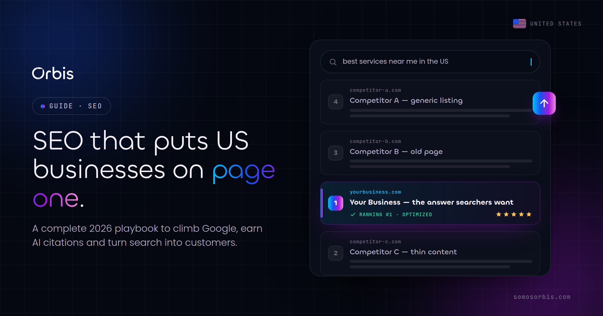
If you run a direct-to-consumer brand in the United States, your Shopify storefront is not a brochure. It is your highest-volume salesperson, working every hour across every time zone from New York to Los Angeles. And during the moments that decide your year, Black Friday and Cyber Monday, Amazon Prime Day, back-to-school, and the post-holiday tax-season lull, the difference between a store that converts and one that leaks revenue comes down to deliberate design decisions made months in advance.
We have spent more than 15 years building and optimizing online stores, and the pattern is consistent: US DTC brands rarely lose sales because of traffic. They lose sales because the theme is bloated, the apps fight each other, the checkout adds friction, and the mobile experience was an afterthought. This guide walks through the choices that actually move revenue, theme selection, the right app stack, and checkout optimization, with the practical detail you need to brief a team or audit your own store.
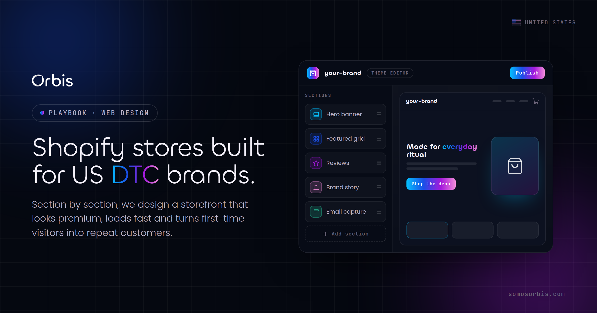
Start With the Theme, But Choose for Speed Before Looks
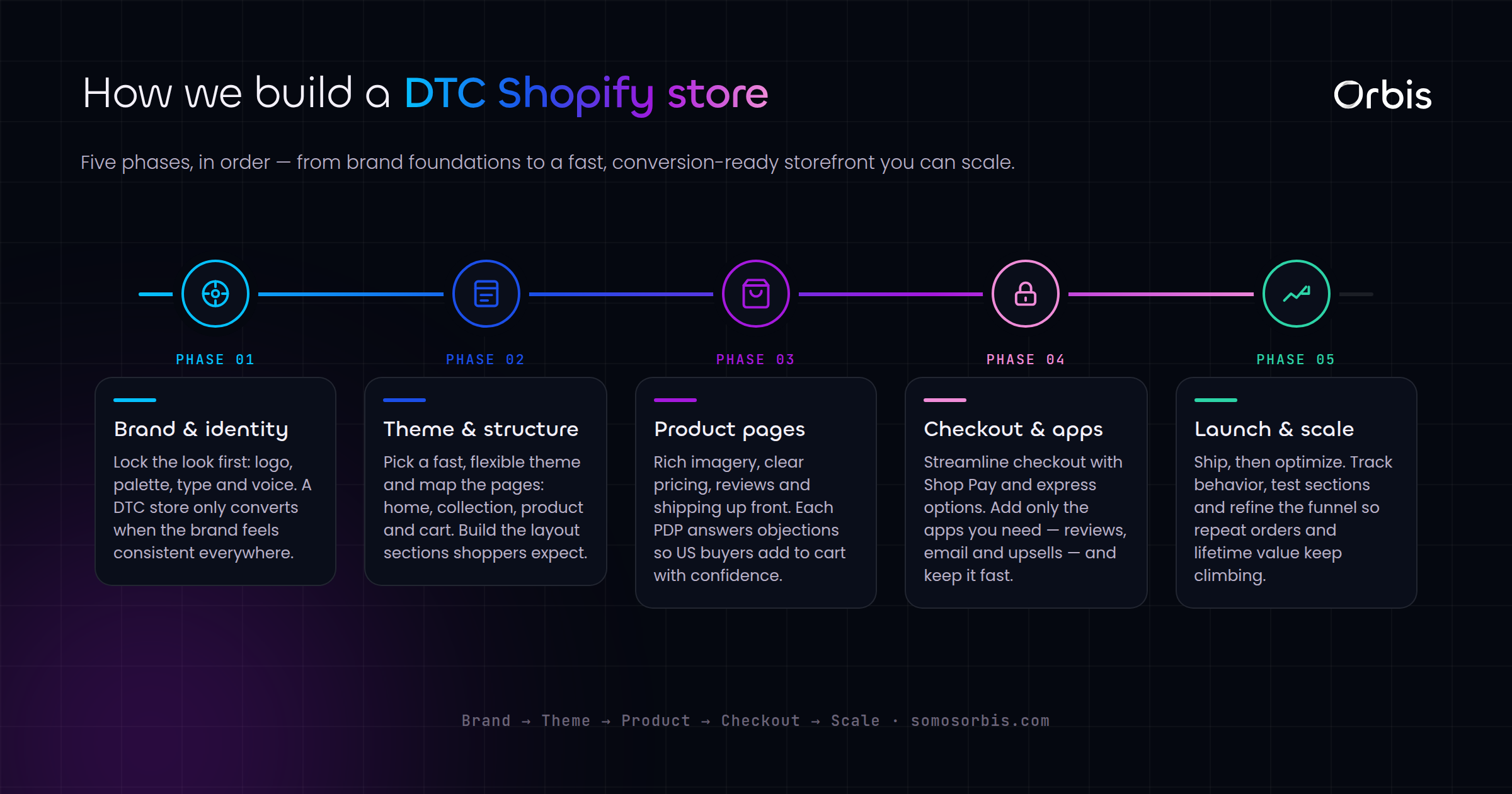
Every Shopify build begins with a theme, and this is where most DTC brands make their first expensive mistake. They pick the theme with the most demo sections and the flashiest animations, then wonder why their Largest Contentful Paint sits at four seconds on a mid-range Android phone in Houston on a 4G connection.
Speed is not a vanity metric. In the US market, where a large share of DTC traffic arrives from paid social on mobile, every additional second of load time measurably depresses conversion and inflates your customer acquisition cost. A fast store lowers your effective CPA across Meta, Pinterest, and Spotify campaigns because more of the clicks you already paid for actually convert.
When selecting and customizing a theme, prioritize in this order:
- Performance budget first. Aim for a mobile load that feels instant. Shopify's Online Store 2.0 themes (Dawn and its derivatives) are built lean and are a safer starting point than heavily pre-styled marketplace themes.
- Sections and blocks you will actually use. A theme with 40 section types you will never touch is 40 opportunities for unused CSS and JavaScript to slow you down.
- Native support for the merchandising you need. If you sell apparel with variant swatches, or bundles, or subscriptions, confirm the theme handles those natively before you reach for an app.
- Brand expression through restraint. Strong typography, generous whitespace, and a tight color system read as premium. Heavy gradients and stacked carousels read as dated.
For US Hispanic audiences, a meaningful and growing segment of DTC demand in Miami, Los Angeles, Dallas, and beyond, plan your theme to support bilingual EN/ES content cleanly. That means a language toggle that does not break layout, hreflang done correctly, and product copy that is genuinely translated rather than machine-dumped. A bilingual store is not just inclusive; it expands your addressable market without spending an extra dollar on ads.
Custom Theme vs. Marketplace Theme
A polished marketplace theme is the right call for an early-stage brand validating demand. Once you are spending real money on acquisition and your conversion rate is the lever that decides profitability, a semi-custom build on a lean base pays for itself. The goal is not bespoke for its own sake, it is removing everything that does not serve the sale and adding the few things that do. If you want a deeper view of how store structure ties into conversion, our companion piece on e-commerce website design for higher US conversion breaks down the layout and merchandising decisions in detail.
Build a Disciplined App Stack, Not an App Graveyard
Shopify's app ecosystem is a genuine advantage and a genuine trap. We routinely audit US DTC stores carrying 25 to 40 installed apps, half of them unused, each one injecting scripts that drag down speed and occasionally conflict with one another. The discipline that separates a healthy store from a slow one is ruthless curation.
Here is the app stack we recommend most DTC brands actually need, organized by job:
- Reviews and social proof. One review app, well configured, with photo reviews enabled. Authentic US customer reviews displayed near the add-to-cart button do more for conversion than any badge.
- Email and SMS. A single platform that owns both, with flows for welcome, abandoned cart, browse abandonment, and post-purchase. This is where your highest-margin revenue lives.
- Upsell and cross-sell. One app for cart and post-purchase upsells. Raising average order value is often easier than raising conversion rate.
- Subscriptions, if your product fits. Consumables, supplements, coffee, and personal care benefit enormously from a clean subscribe-and-save experience.
- Search and merchandising. If your catalog is large, a smart search and filtering app earns its keep by getting shoppers to the right product faster.
- Bundles. Native bundle functionality or a single lightweight app to drive larger carts during peak seasons.
Notice what is not on that list: redundant popup apps, three different trust-badge tools, a separate currency app you do not need because you sell in USD, and the half-dozen widgets installed during a free trial and never removed. Before every peak season, run an app audit. Uninstall anything you cannot tie to revenue, and confirm the remaining apps load asynchronously and do not block rendering.
Apps and Performance Are the Same Conversation
A common scenario in Chicago and Dallas client audits: a brand adds an app to lift conversion, the app adds 600 milliseconds to load time, and the net effect on revenue is negative because the speed penalty outweighs the feature gain. Always measure the before and after. An app that helps in a vacuum can hurt in context. This is exactly the kind of trade-off our Shopify web design services are built to evaluate, so you keep the features that pay and cut the ones that cost.
Checkout Optimization: Where US DTC Revenue Is Won or Lost
The checkout is the most consequential surface in your entire store, and the one most brands neglect because Shopify handles it for them by default. Cart abandonment in US e-commerce routinely runs around 70 percent, and a large share of that is preventable friction. Every field you remove, every surprise you eliminate, and every reassurance you add at the right moment recovers revenue you have already paid to acquire.
Focus your checkout optimization here:
- Accelerated wallets, prominently placed. Shop Pay, Apple Pay, Google Pay, and PayPal let returning shoppers buy in seconds. On mobile, where most US DTC traffic lives, one-tap payment is the single biggest abandonment reducer available to you.
- Total transparency on cost. Show shipping and tax expectations as early as possible. The number one stated reason US shoppers abandon carts is unexpected extra costs at checkout. Free-shipping thresholds, clearly communicated, both reduce abandonment and lift average order value.
- Guest checkout, always. Forcing account creation before purchase is a self-inflicted wound. Offer the account after the sale, not before it.
- Trust where the decision happens. Place return policy, secure-payment reassurance, and a clear delivery estimate right at the checkout, not buried three clicks away.
- USD pricing, clean and consistent. Because your core market transacts in USD, keep pricing unambiguous and avoid the cognitive load of currency switching unless you are genuinely selling cross-border.
For brands serving bilingual customers, ensure the checkout itself respects the shopper's language. A store that markets in Spanish but checks out only in English creates a jarring last-mile experience precisely when confidence matters most. Shopify Markets and proper localization settings let you keep the entire path coherent.
Privacy and Trust Are Now Part of Conversion
US shoppers, particularly in California, increasingly expect clarity about how their data is used. Honoring current privacy norms, clear consent for tracking, an accessible privacy choice, and honest data practices, is no longer just a compliance checkbox. It is a trust signal that supports conversion. Build your consent and tracking setup so it respects shopper preferences without breaking your analytics. Getting this right protects both your customer relationships and the measurement you rely on to optimize. We treat this as compliance by design rather than a bolt-on, so your store meets the requirements of current regulations while staying fast and conversion-friendly.
Design for the US Peak-Season Calendar
A DTC store is not static. It should flex around the moments that drive the bulk of annual revenue. Build the flexibility in advance so you are not rebuilding under pressure in November.
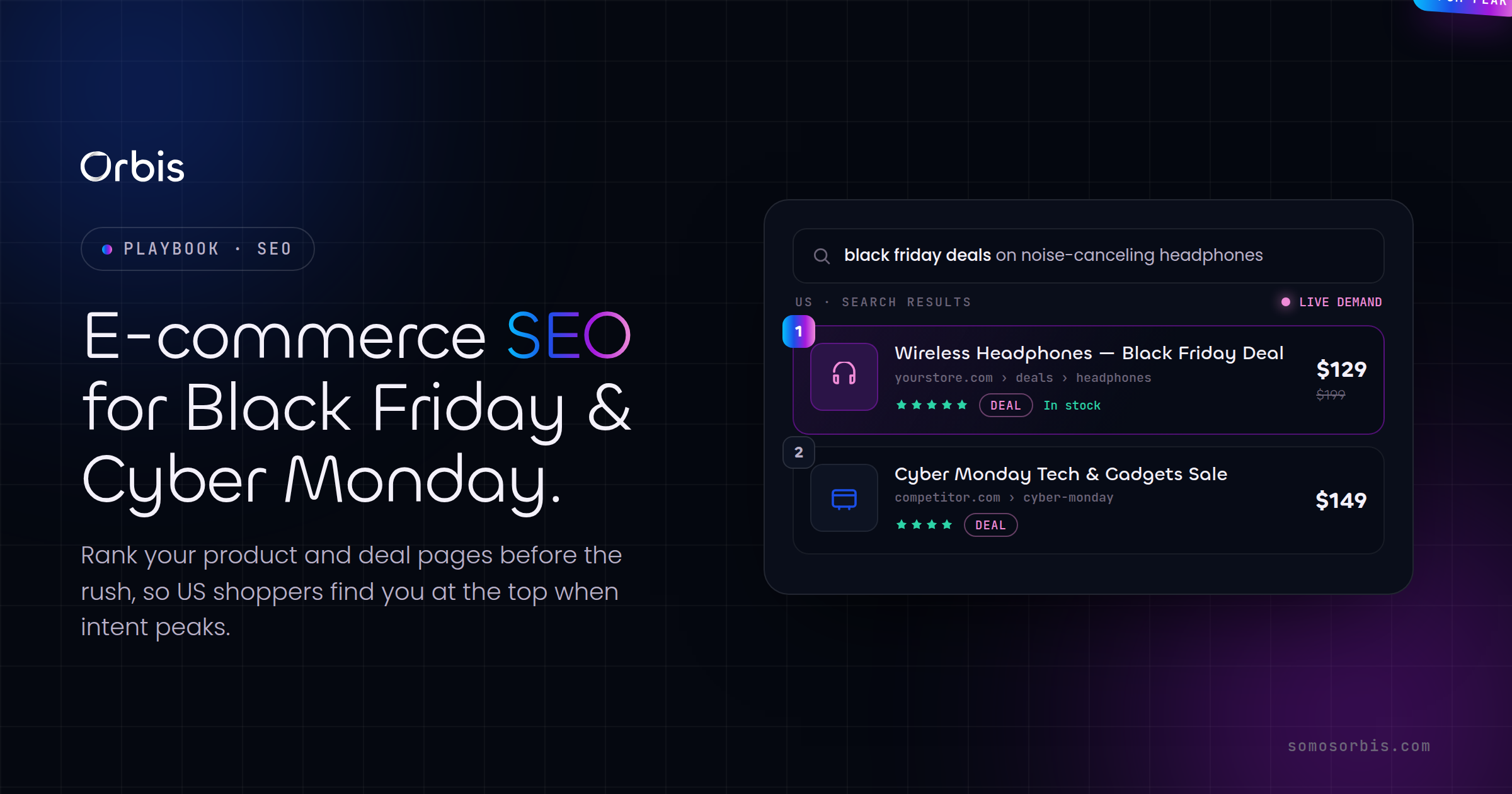
- Black Friday and Cyber Monday. Pre-build promotional sections, countdown banners, and gift-guide collections weeks ahead. Stress-test your store for traffic spikes and confirm your app stack does not buckle under load.
- Amazon Prime Day. Even off-Amazon, the mid-summer demand surge is real. Run your own competing promotion and make sure your storefront is ready to capture the spillover.
- Back-to-school. For apparel, supplies, tech accessories, and home goods, the late-summer window is a major revenue pulse. Merchandise collections and bundles specifically for it.
- Tax season and the post-holiday lull. Plan retention and subscription pushes for the quieter first quarter. This is when win-back flows and loyalty offers protect revenue while acquisition costs are seasonally favorable.
The brands that win these moments are not the ones that scramble in October. They are the ones whose store architecture, theme flexibility, and app stack were designed from the start to handle seasonal merchandising without a rebuild.
A Practical Pre-Launch and Audit Checklist
Whether you are launching a new store or auditing an existing one, run through this before you call it done:
- Mobile load time is genuinely fast on a real mid-range phone over a real cellular connection, not just on your office wifi.
- Every installed app maps to a clear revenue or operational job; everything else is uninstalled.
- Accelerated checkout wallets are enabled and prominently placed.
- Shipping and tax expectations appear early, and a free-shipping threshold is communicated clearly.
- Guest checkout is available and account creation is optional and post-purchase.
- Bilingual EN/ES content, if relevant to your audience, is consistent from landing page through checkout.
- Consent and privacy choices honor current US norms without breaking your analytics.
- Promotional sections and seasonal collections can be turned on without developer help.
- Reviews and social proof appear near the add-to-cart and checkout decisions.
None of these are exotic. They are the unglamorous fundamentals that separate stores that quietly compound revenue from stores that need ever-larger ad budgets to stay flat.
Where Store Design Fits in the Bigger Picture
Shopify store design does not exist in isolation. It sits inside a broader web-design discipline that covers information architecture, performance, accessibility, and conversion across every page a shopper touches. If you want the full strategic context for building a high-performing site in the US market, start with our pillar resource, the complete web design guide for US businesses in 2026, and pair it with our deep dive on e-commerce website design for higher US conversion. Together they give you the upstream strategy and the conversion mechanics that a well-built Shopify store puts into practice.
A great Shopify store is not the one with the most features. It is the one that removes every gram of friction between a US shopper deciding to buy and the purchase being complete, on the first try, on their phone.
Ready to Build a Store That Converts?
You do not have to guess your way through theme selection, app curation, and checkout optimization. We have done this hundreds of times for brands across the United States, and we bring documented processes, revenue engineering, and compliance by design to every build, so the result is fast, trustworthy, and ready for every peak season on the US calendar. If you want a storefront engineered to turn the traffic you already pay for into orders, explore our Shopify web design services and let's build something that earns its keep. Whether you are in New York, Miami, Chicago, or anywhere in between, the playbook is the same: design for speed, design for trust, and design for the moment your customer is ready to buy.